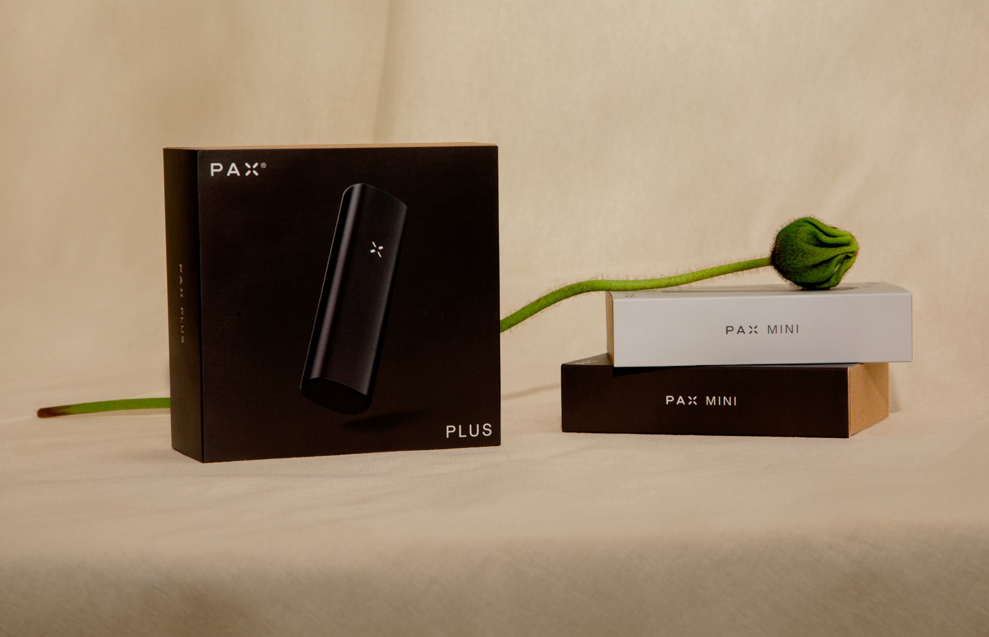
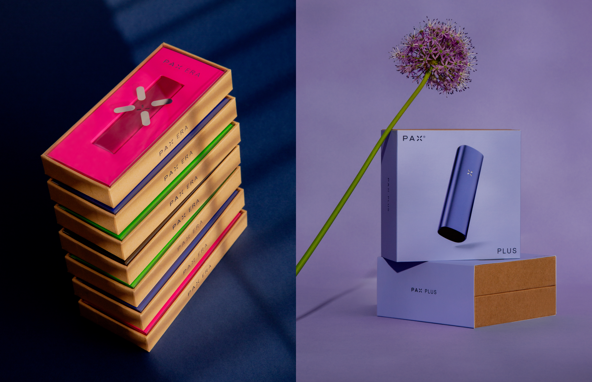
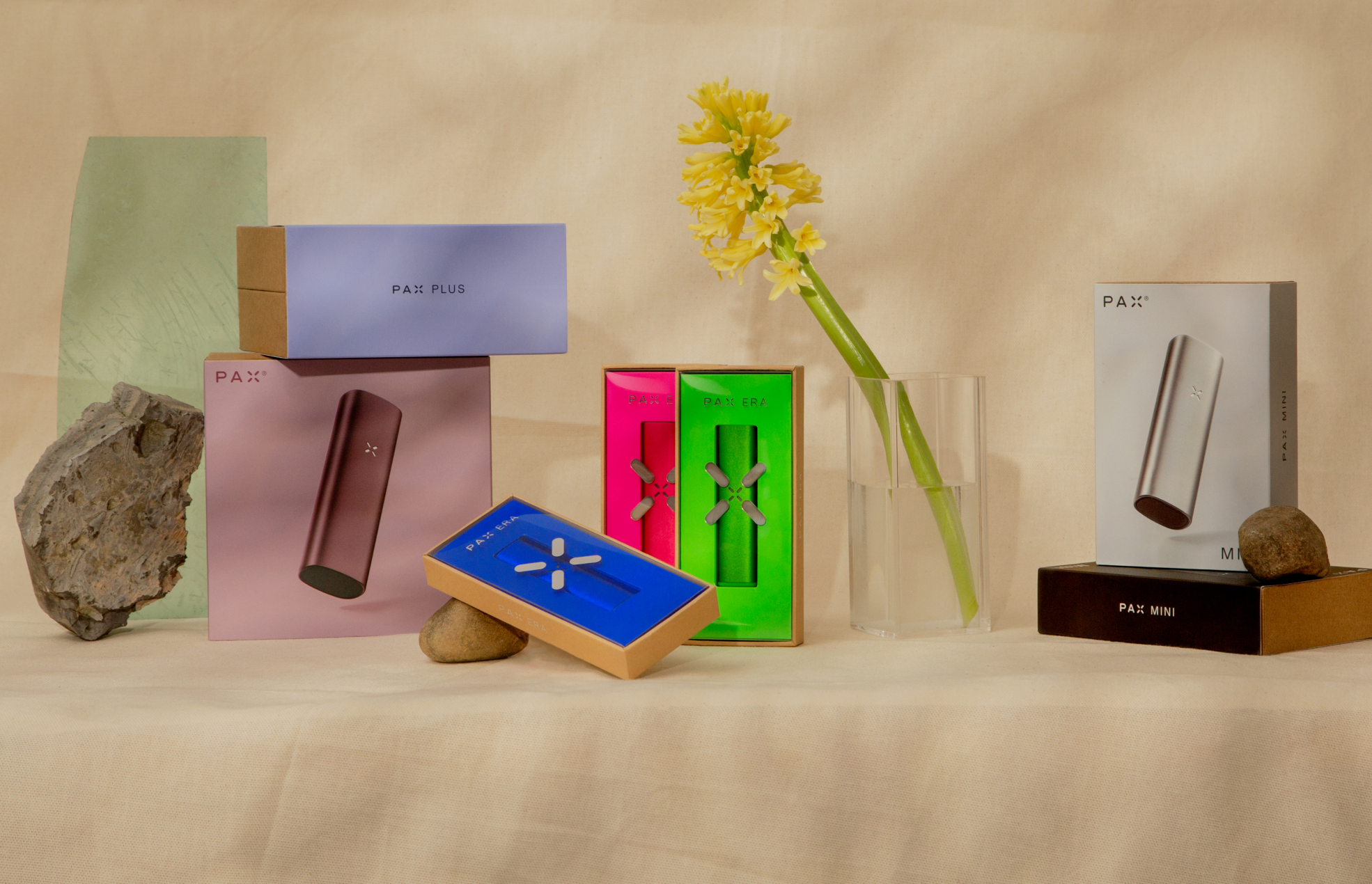
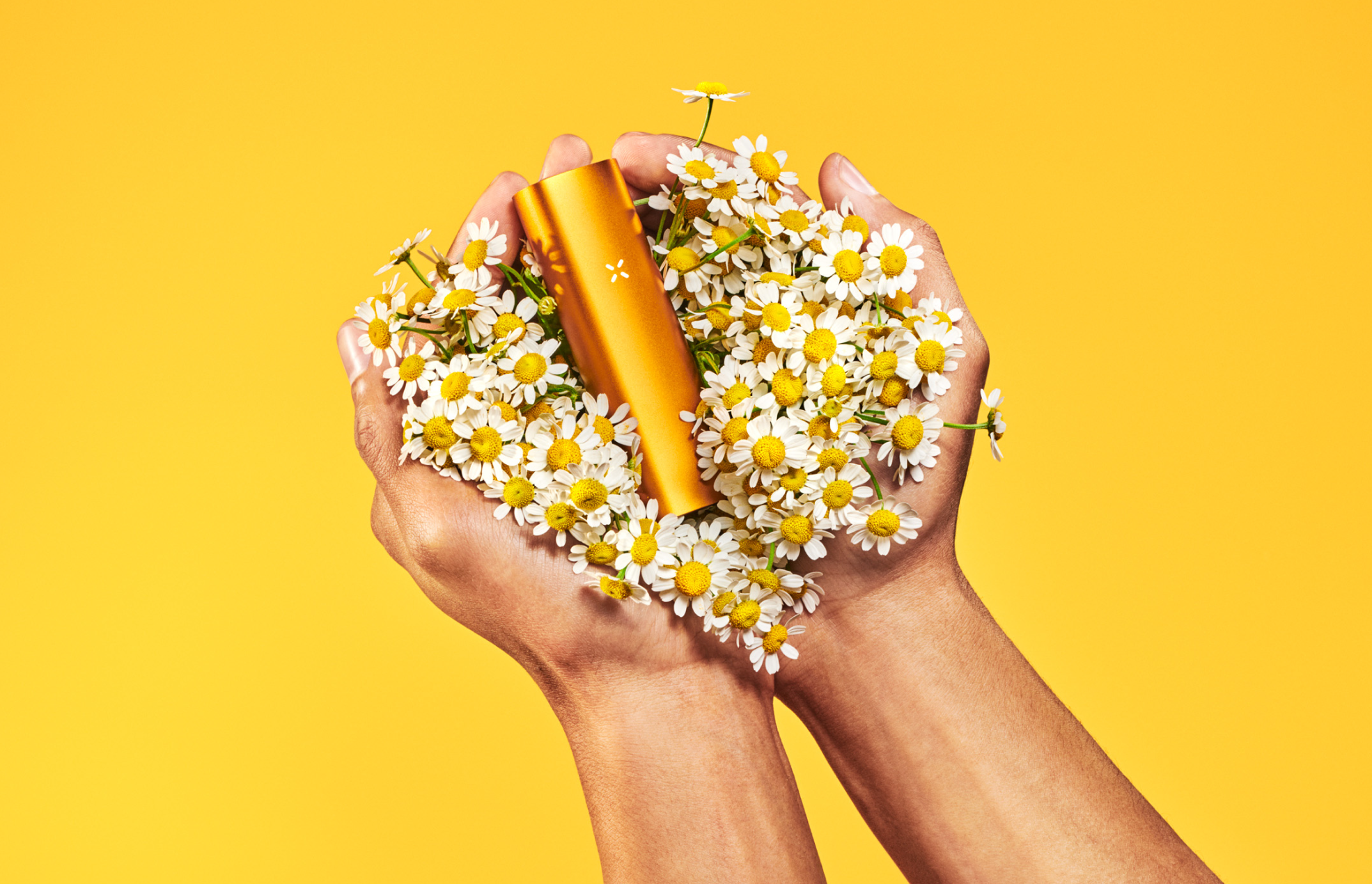
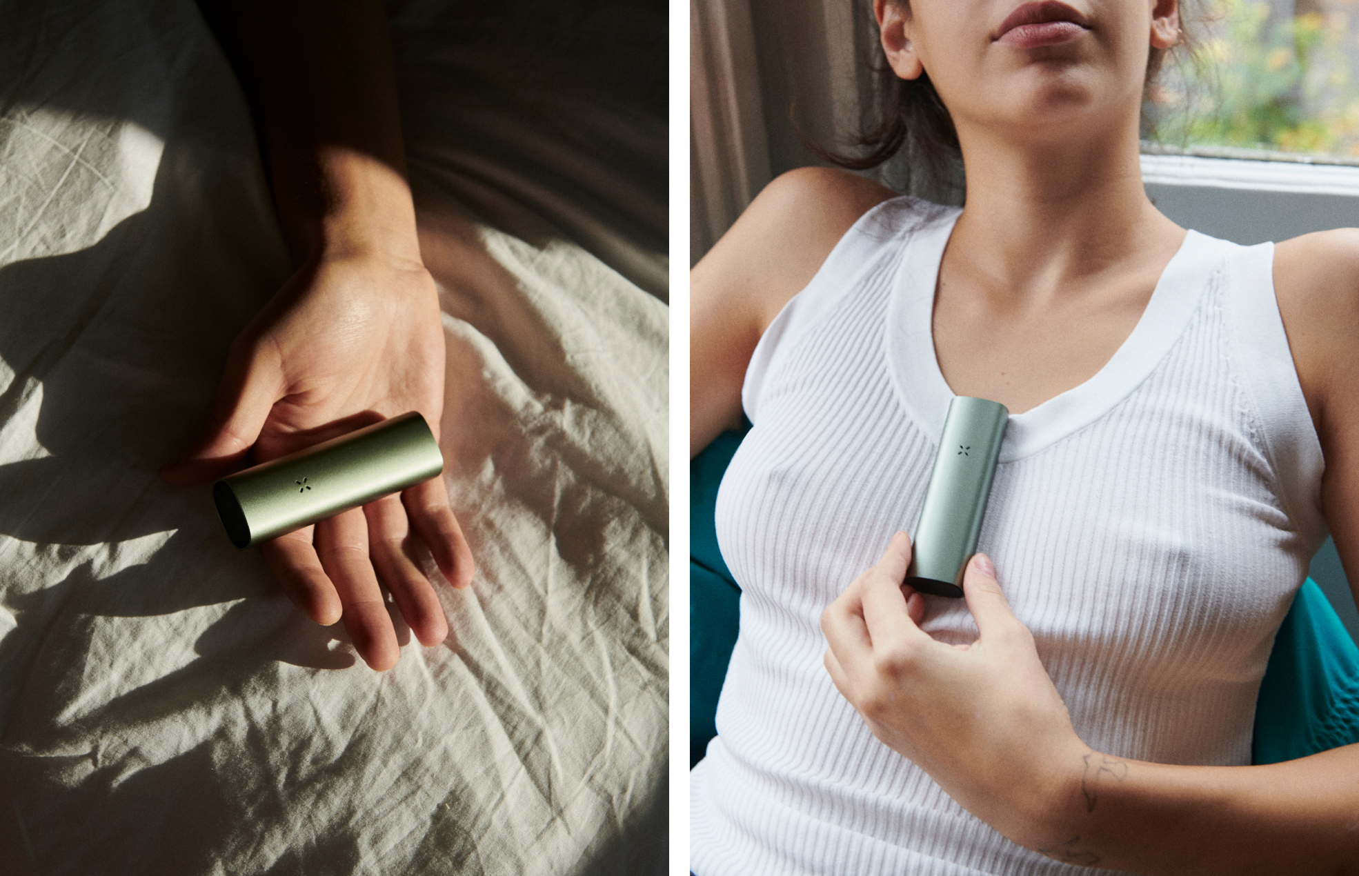
NÜ PAX PKG
PACKAGING DESIGN
Bold colors, slick surfaces, and natural textures collide in a new packaging system crafted for PAX. The updated language prioritizes sustainability over design complexities, with a focus on one-size-fits-all recyclable constructions, universal components, and a “less is more” approach to design.DIELINE AWARDS 2023
2x Silver Medal Recipient
CREATIVE DIRECTION: Marc Hohmann
PHOTOGRAPHY: Eric Helgas
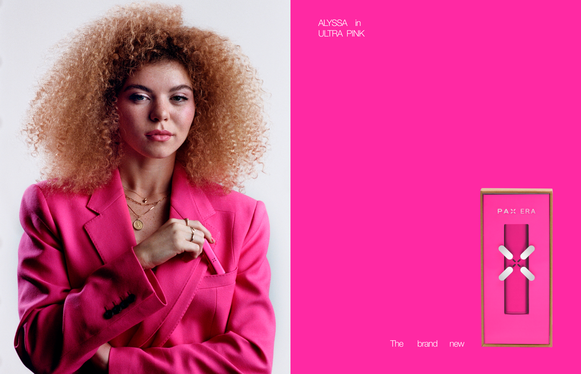
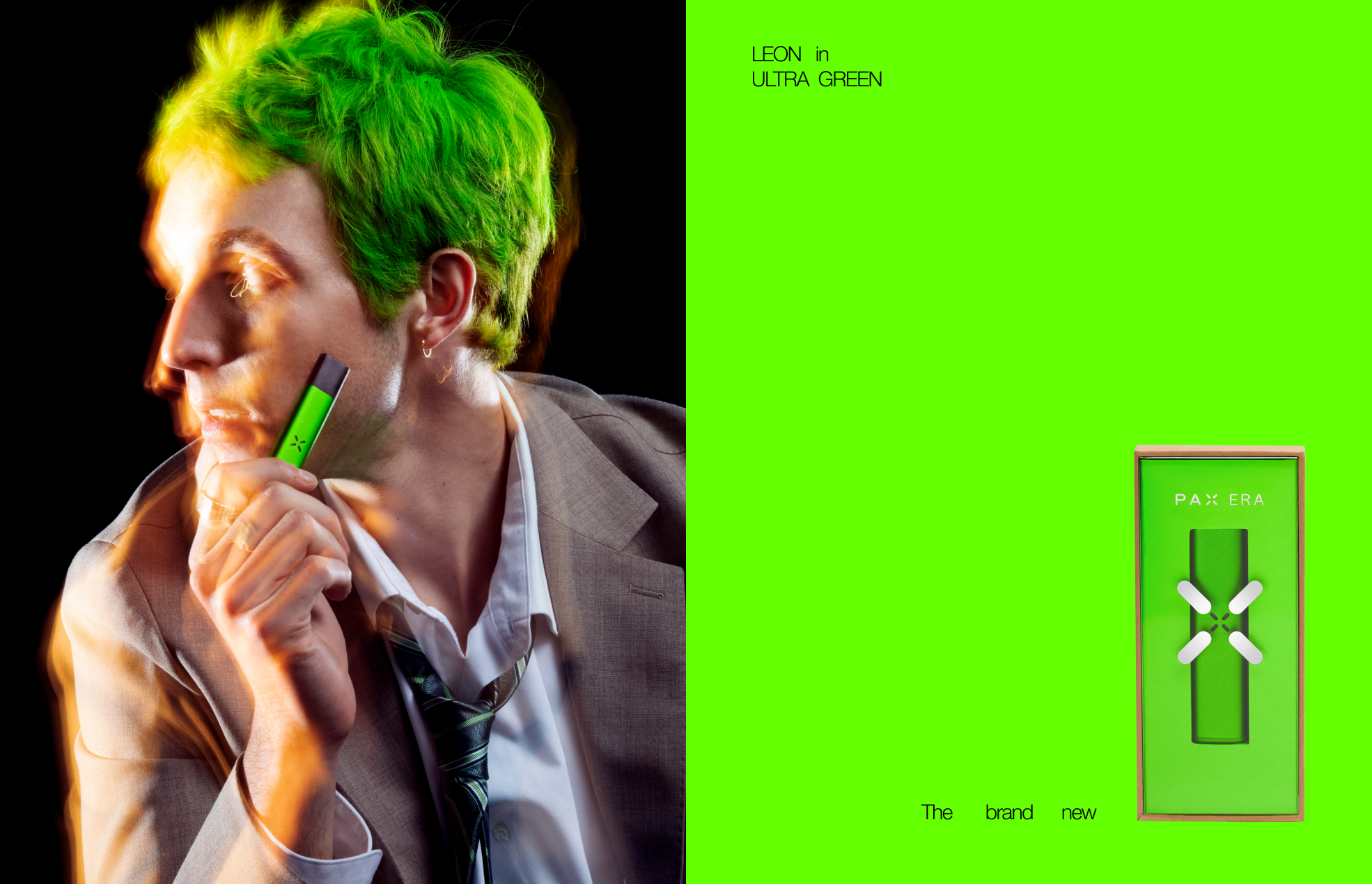
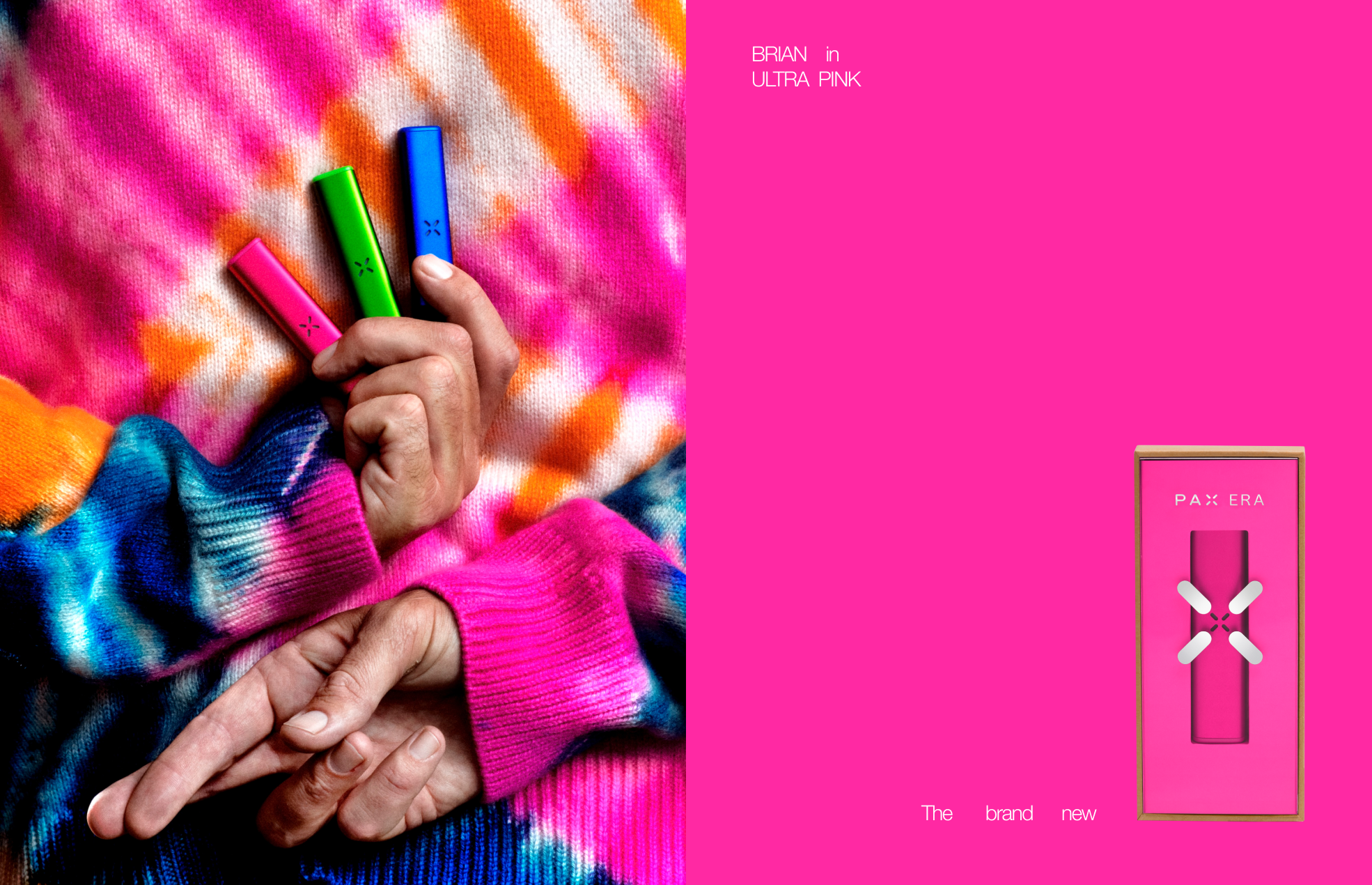
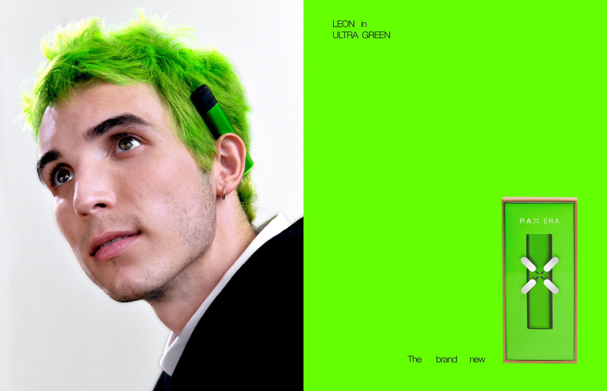
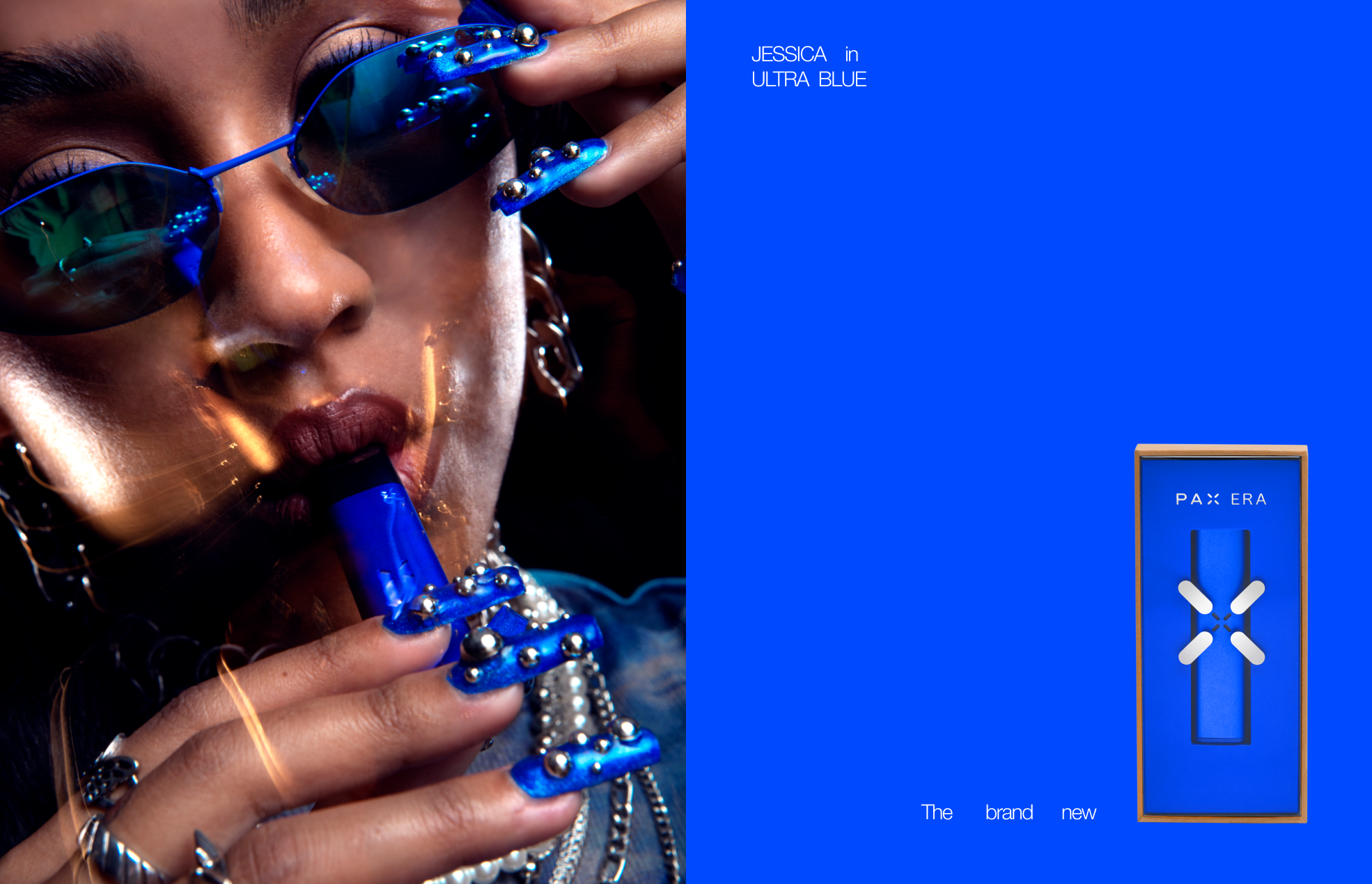
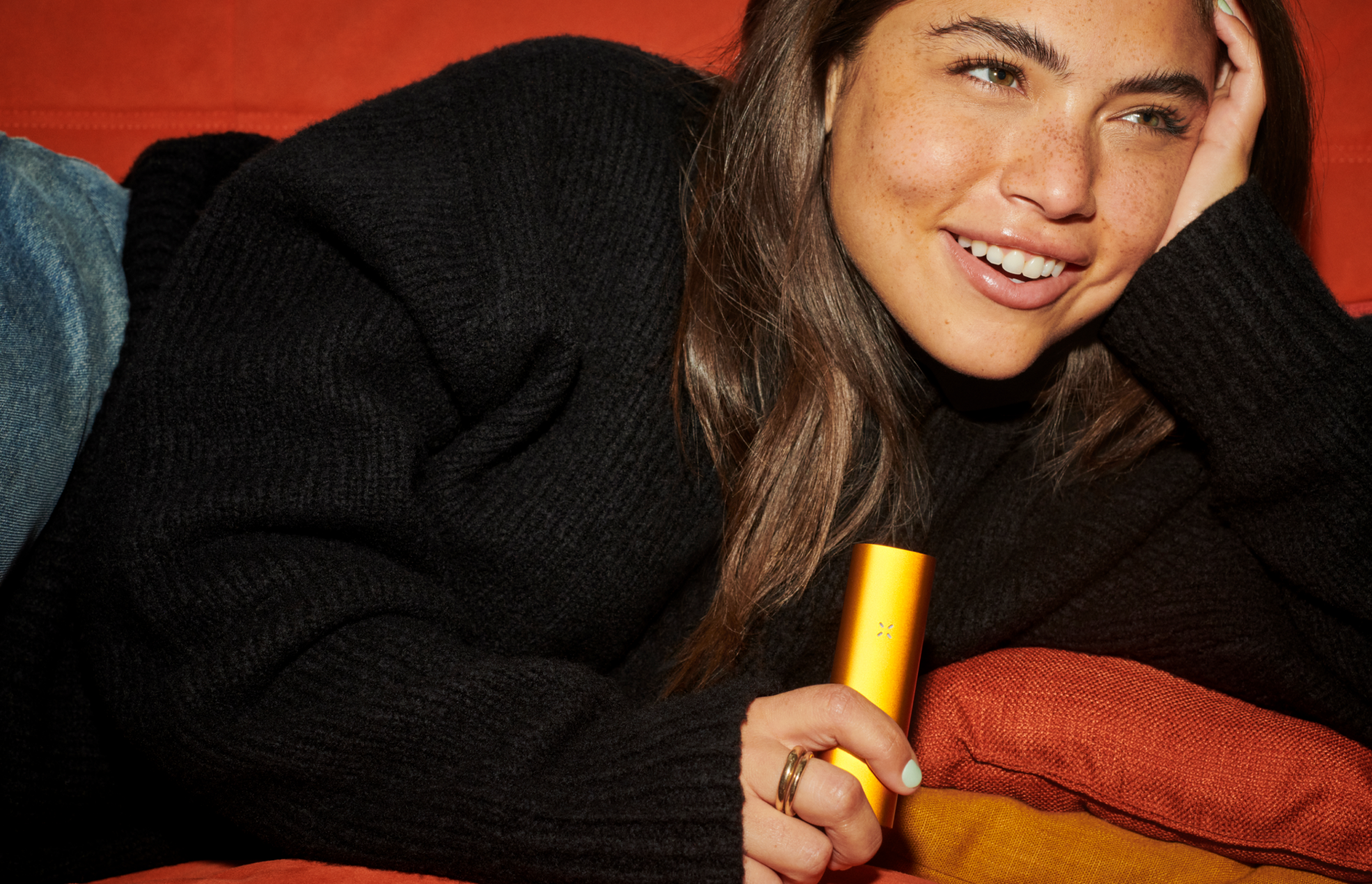
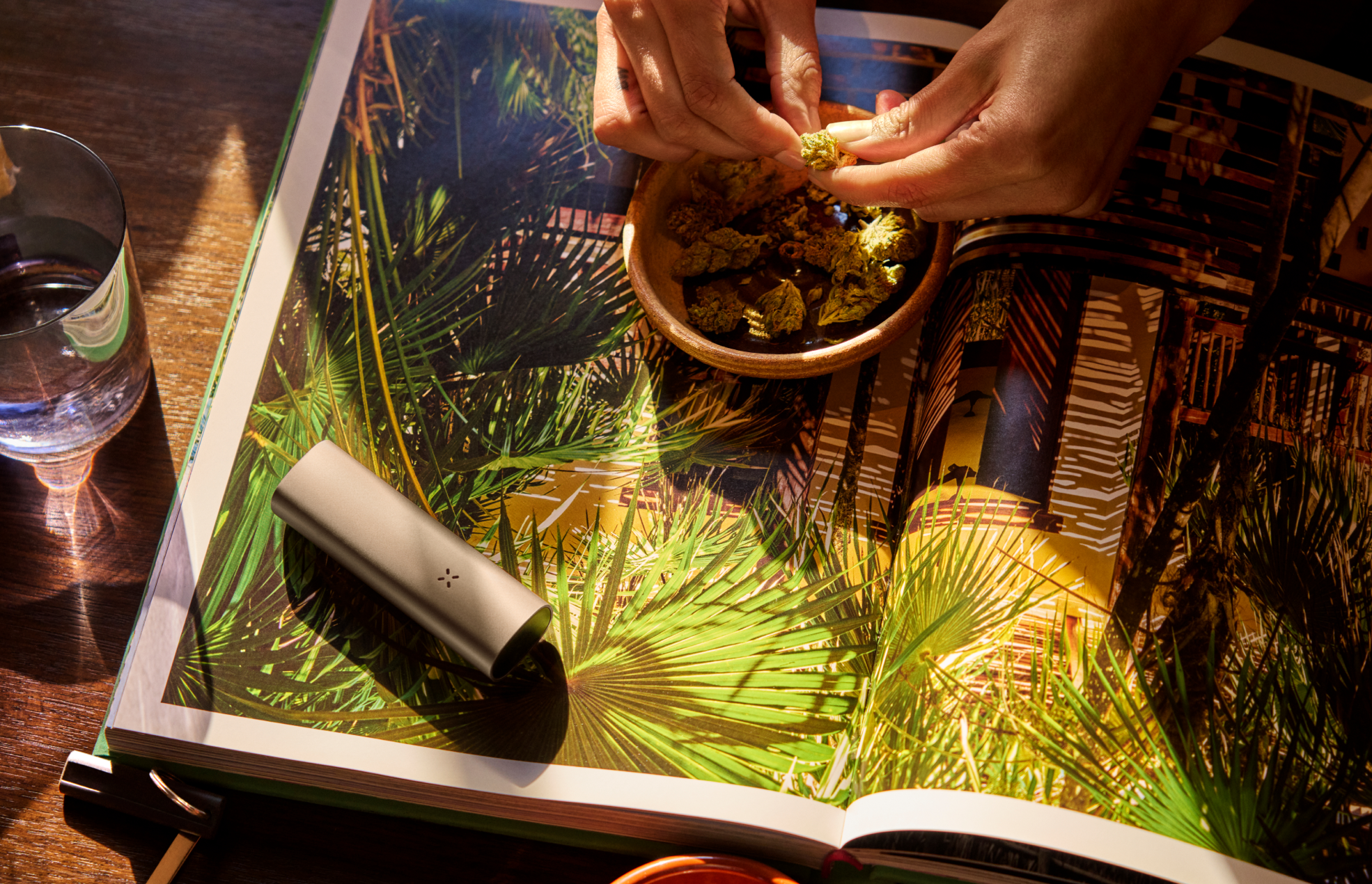
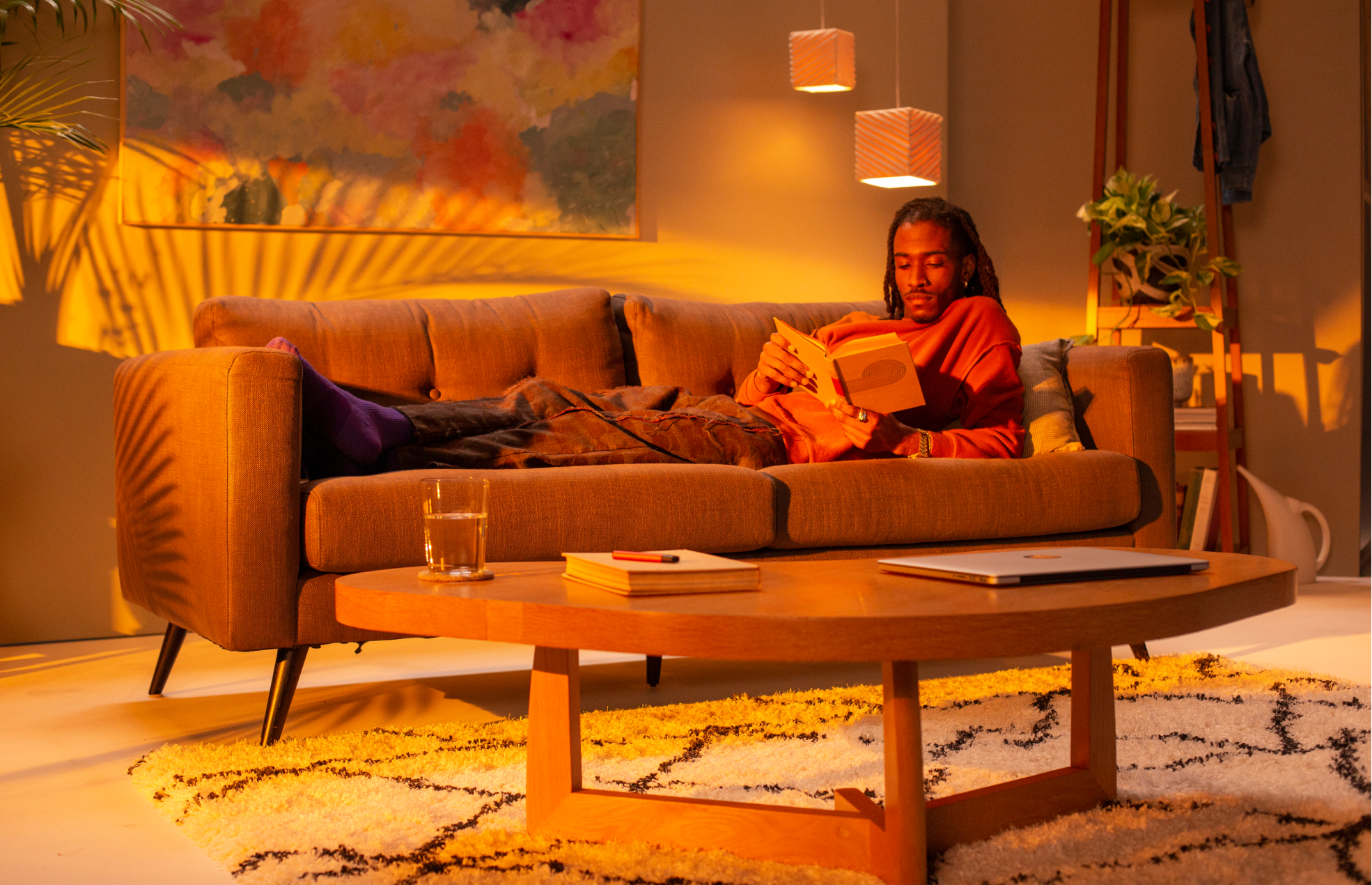
ERA ULTRA CAMPAIGN
ART DIRECTION, DESIGNBack in the garden
We're getting high now
Because we're older
CREATIVE DIRECTION: Marc Hohmann
WITH: Abby Lowenstein
PHOTOGRAPHY: Lindsay Ellary

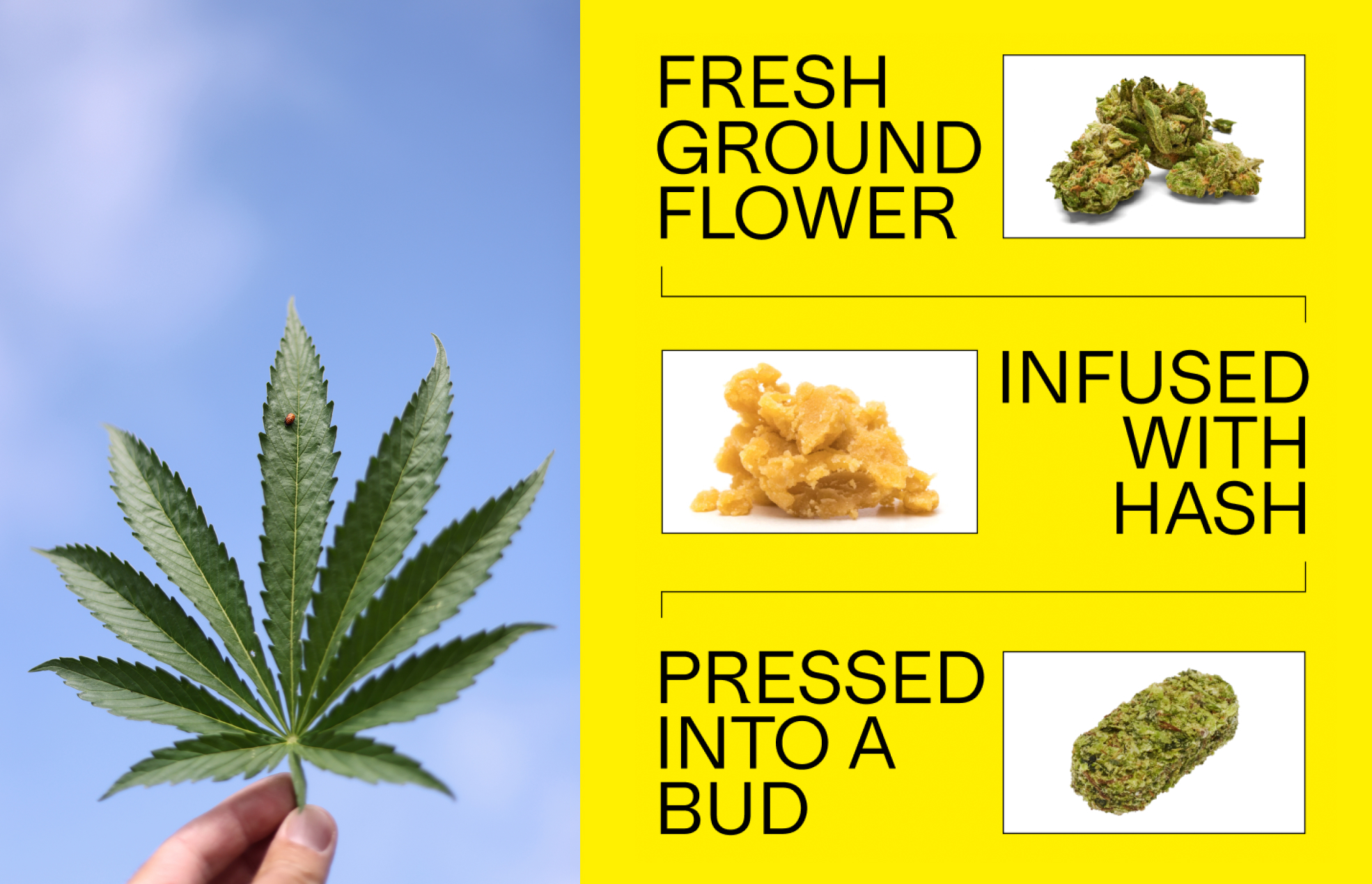
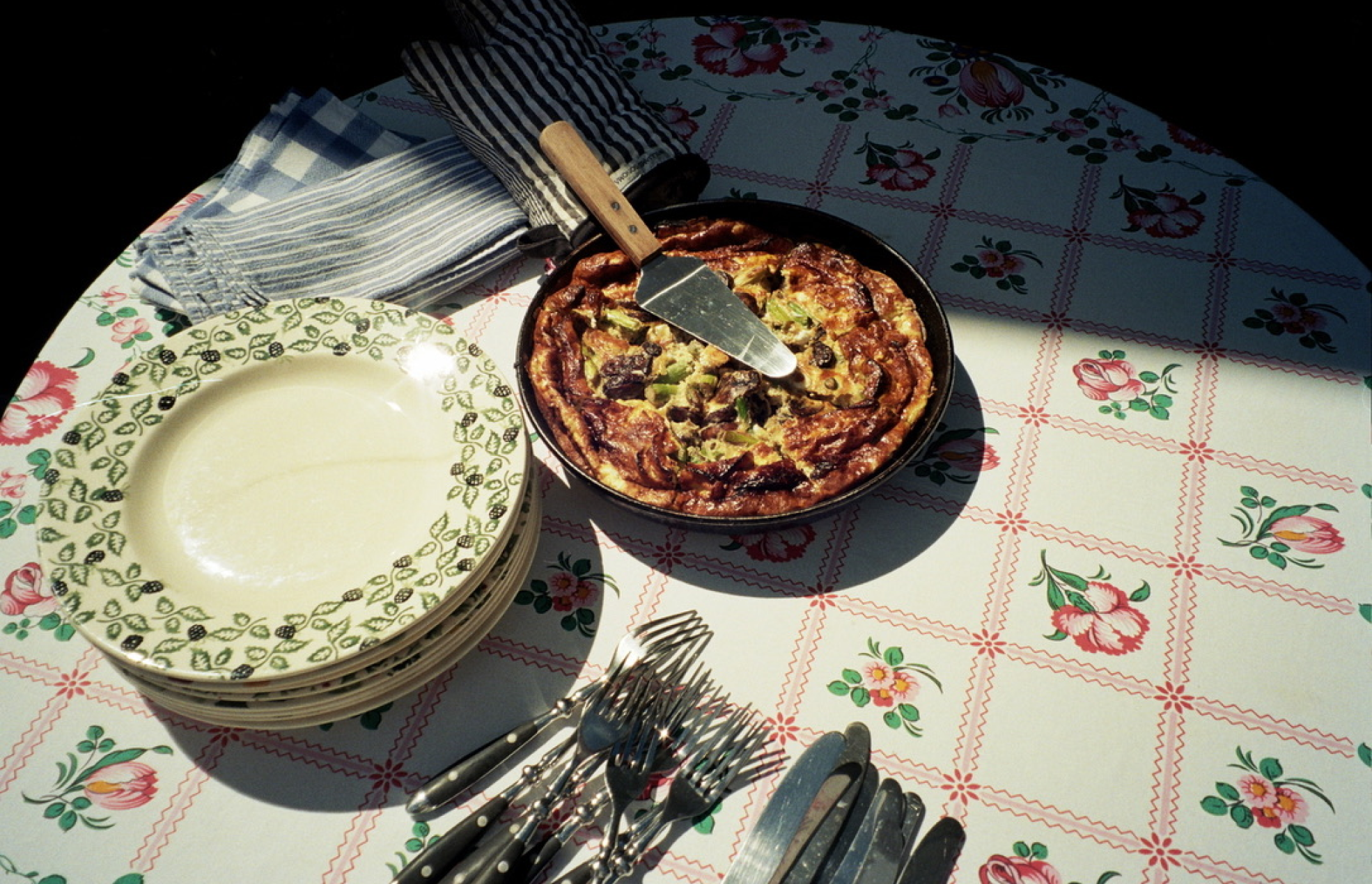
SUNFLOWER
ART DIRECTION, PACKAGING DESIGNReal brushstrokes, real sunlight, real weed, real hash, real good. Put that in your pipe and vape it.
CREATIVE DIRECTION: Marc Hohmann
PHOTOGRAPHY: Ian Shiver


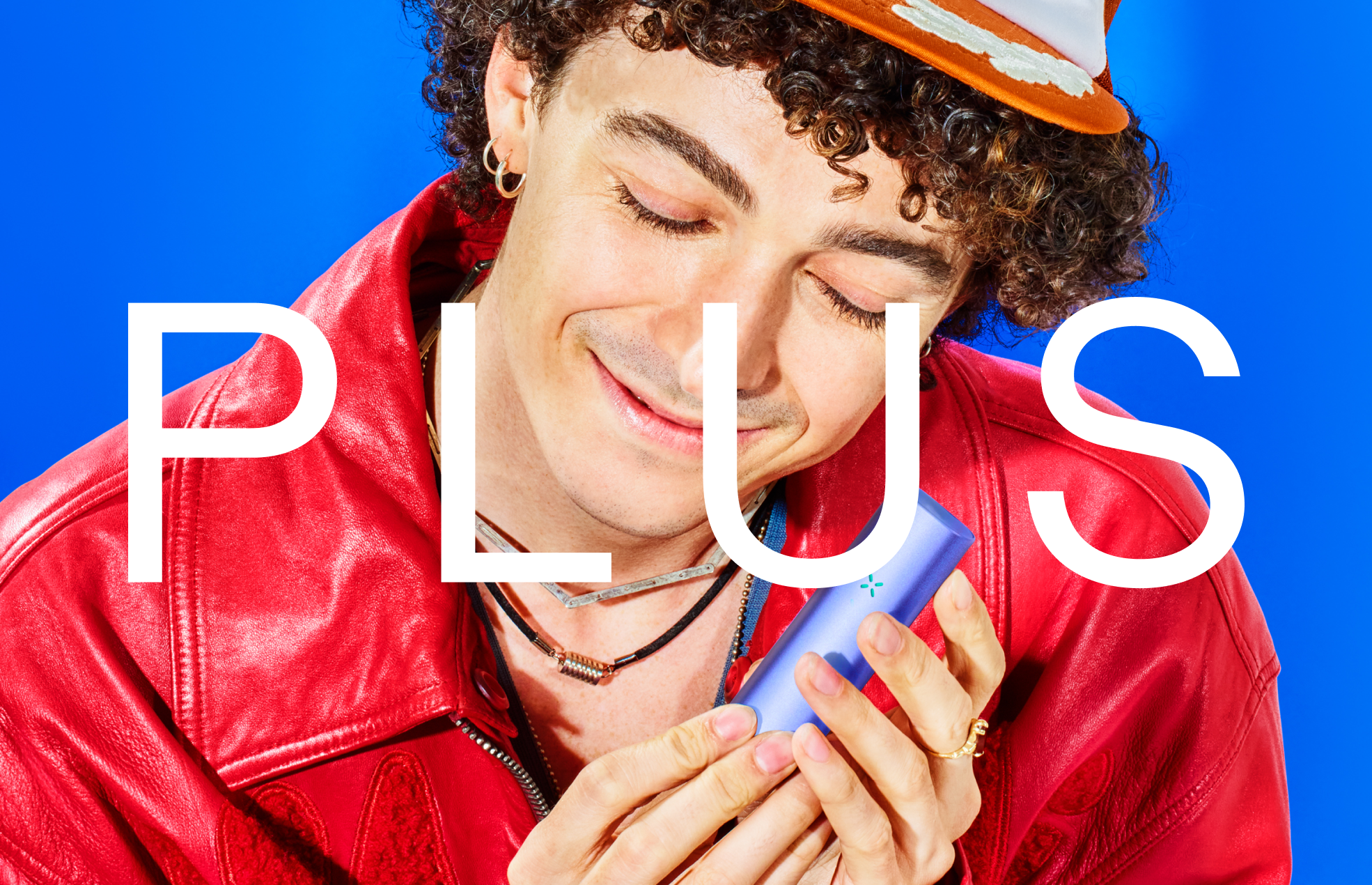
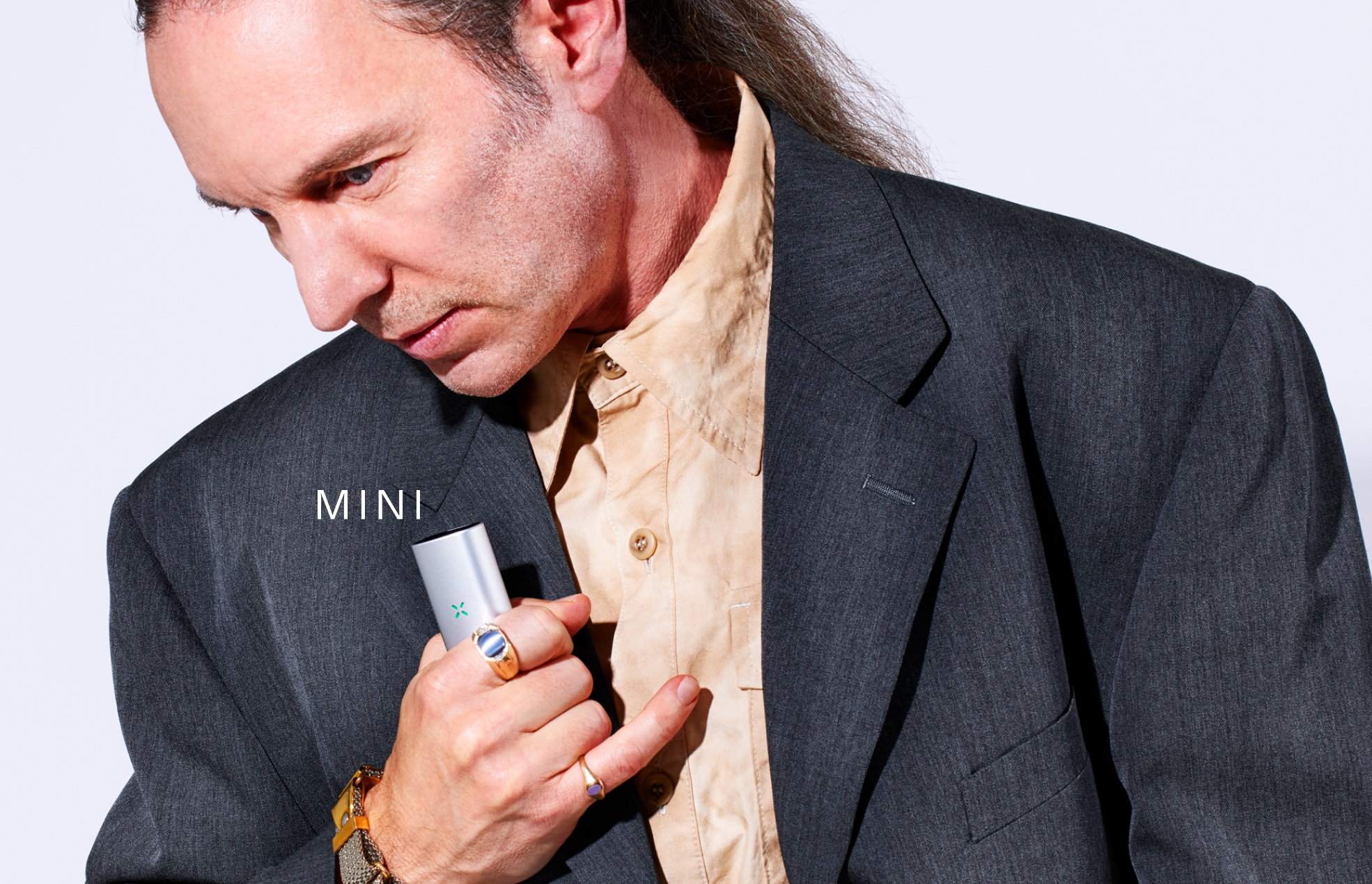
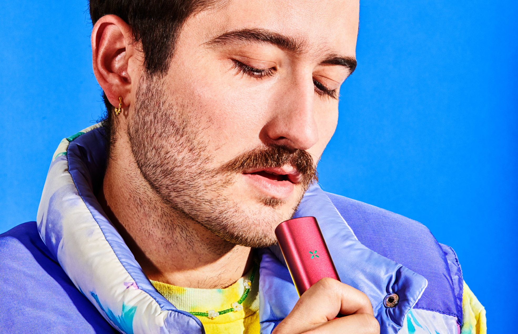
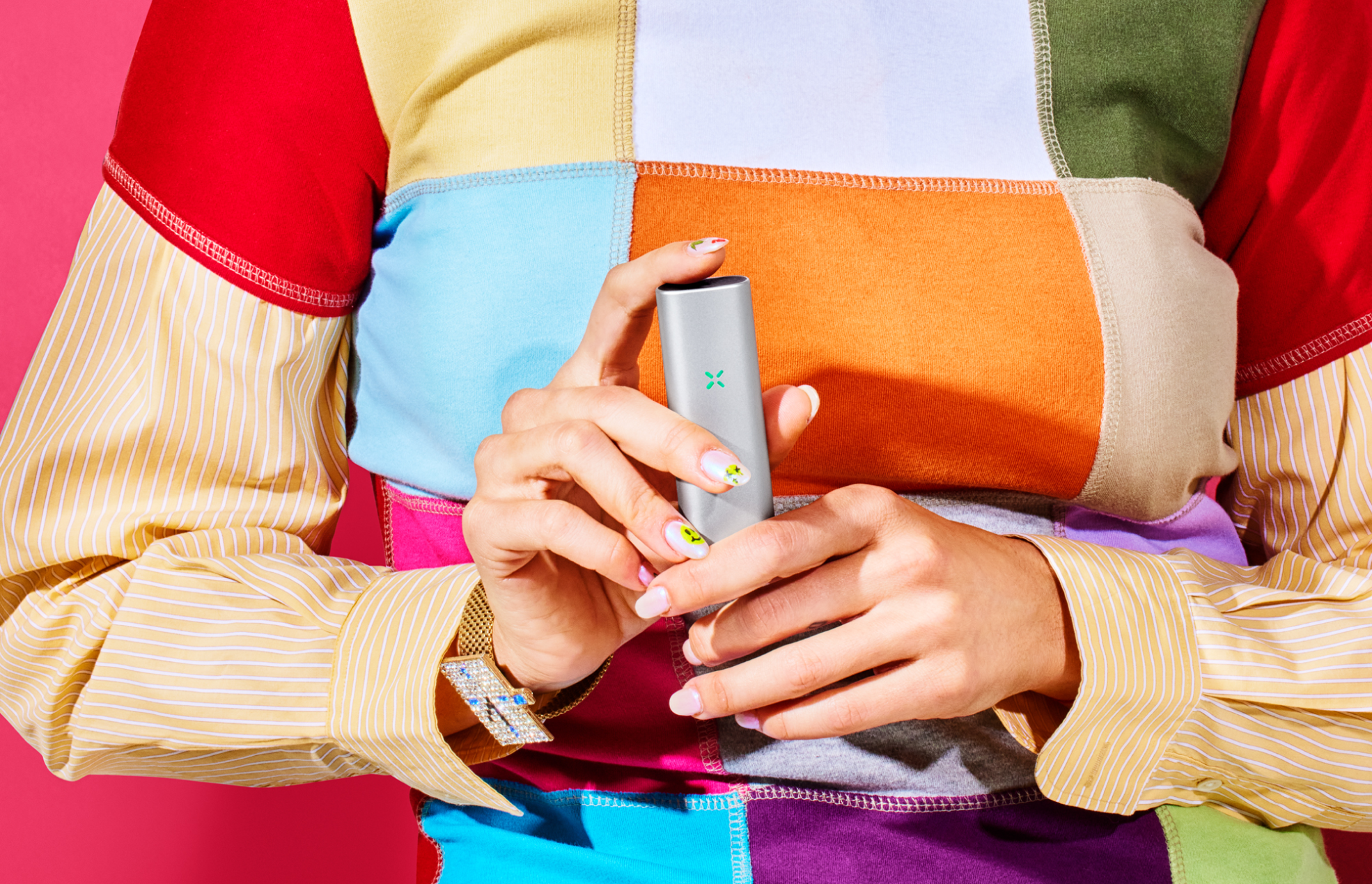
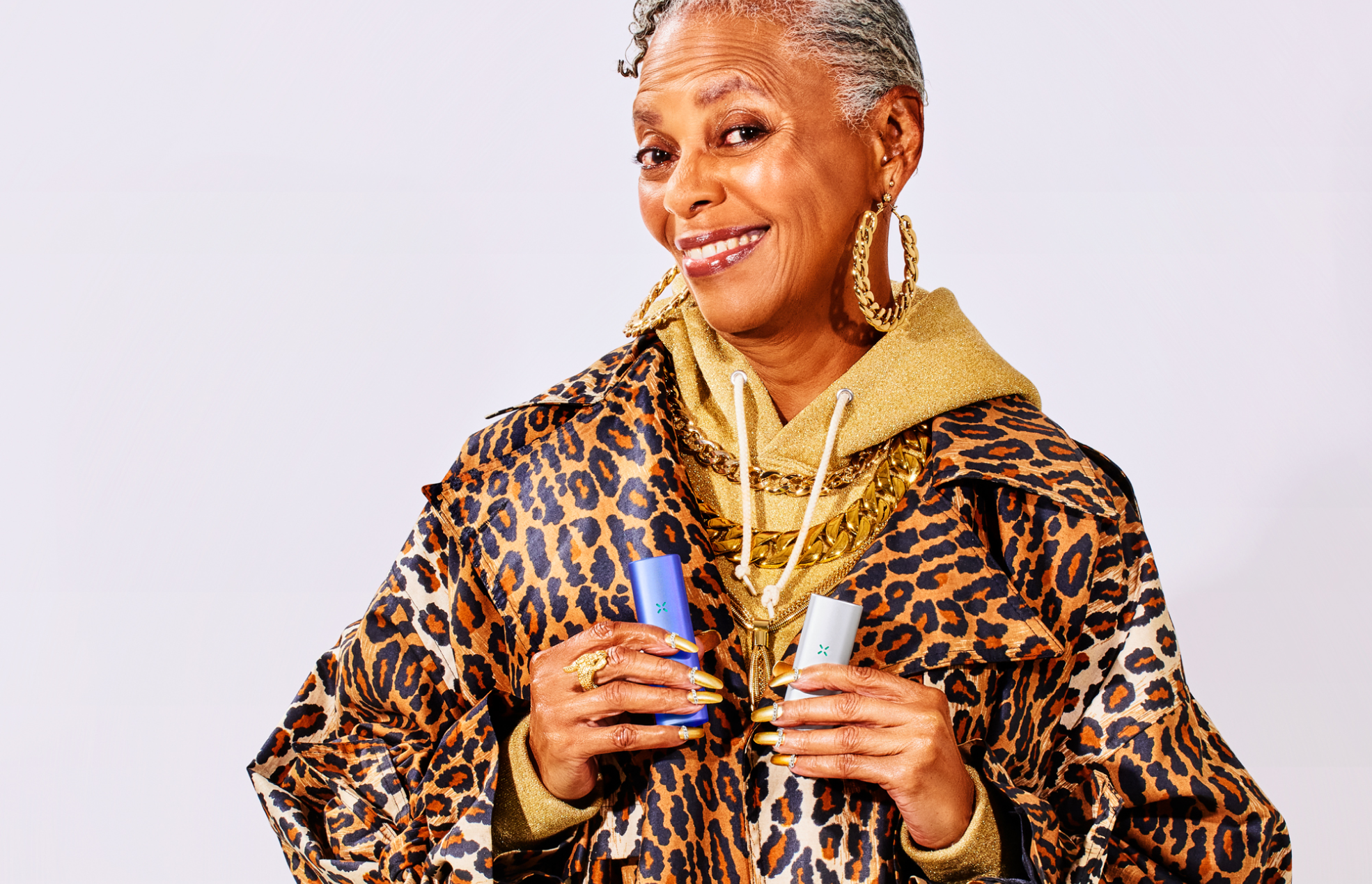
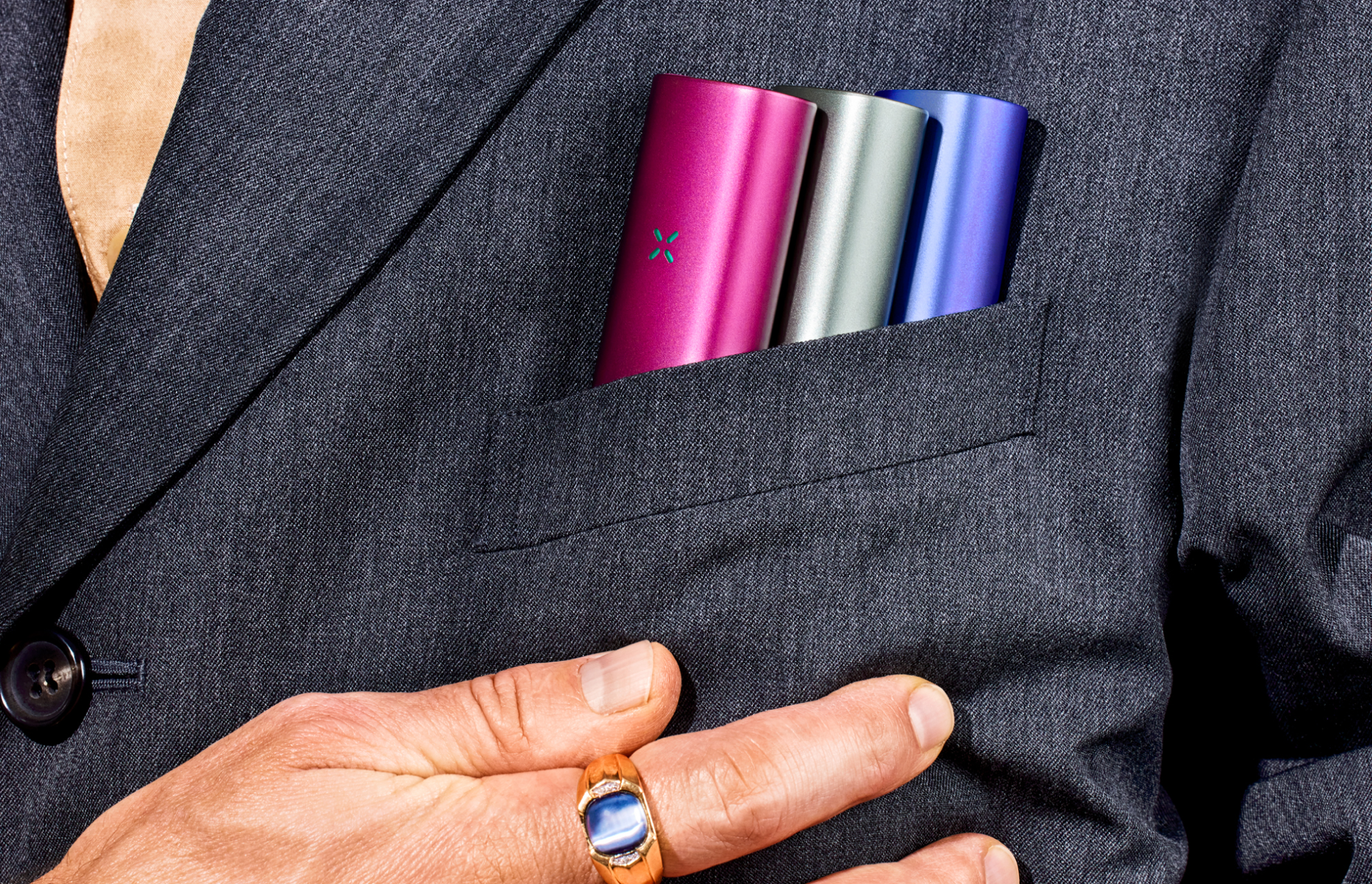
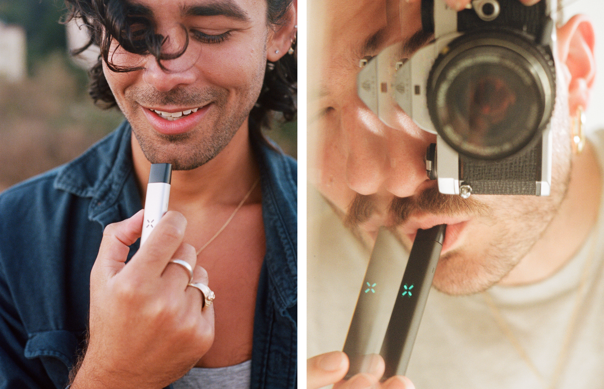
MINI PLUS CAMPAIGN
ART DIRECTIONSculptors, skaters, scriptwriters. An investment banker with wrist tattoos in a Yohji suit. Your boyfriend’s antique-dealing aunt. The hottest couple at the bar. A stoner can look like anything <3
CREATIVE DIRECTION: Marc Hohmann
PHOTOGRAPHY: Evan Angelastro


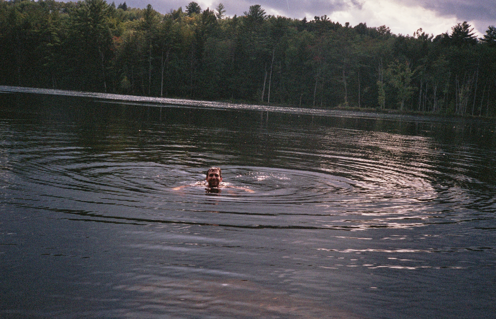
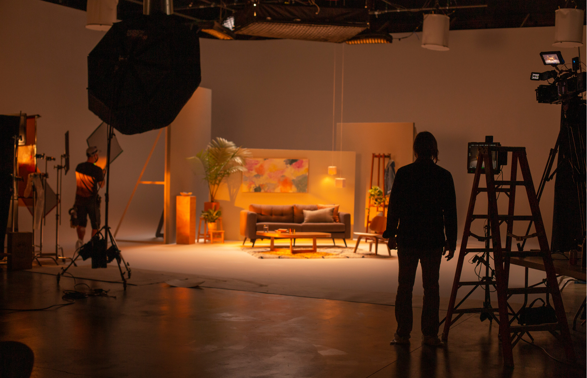
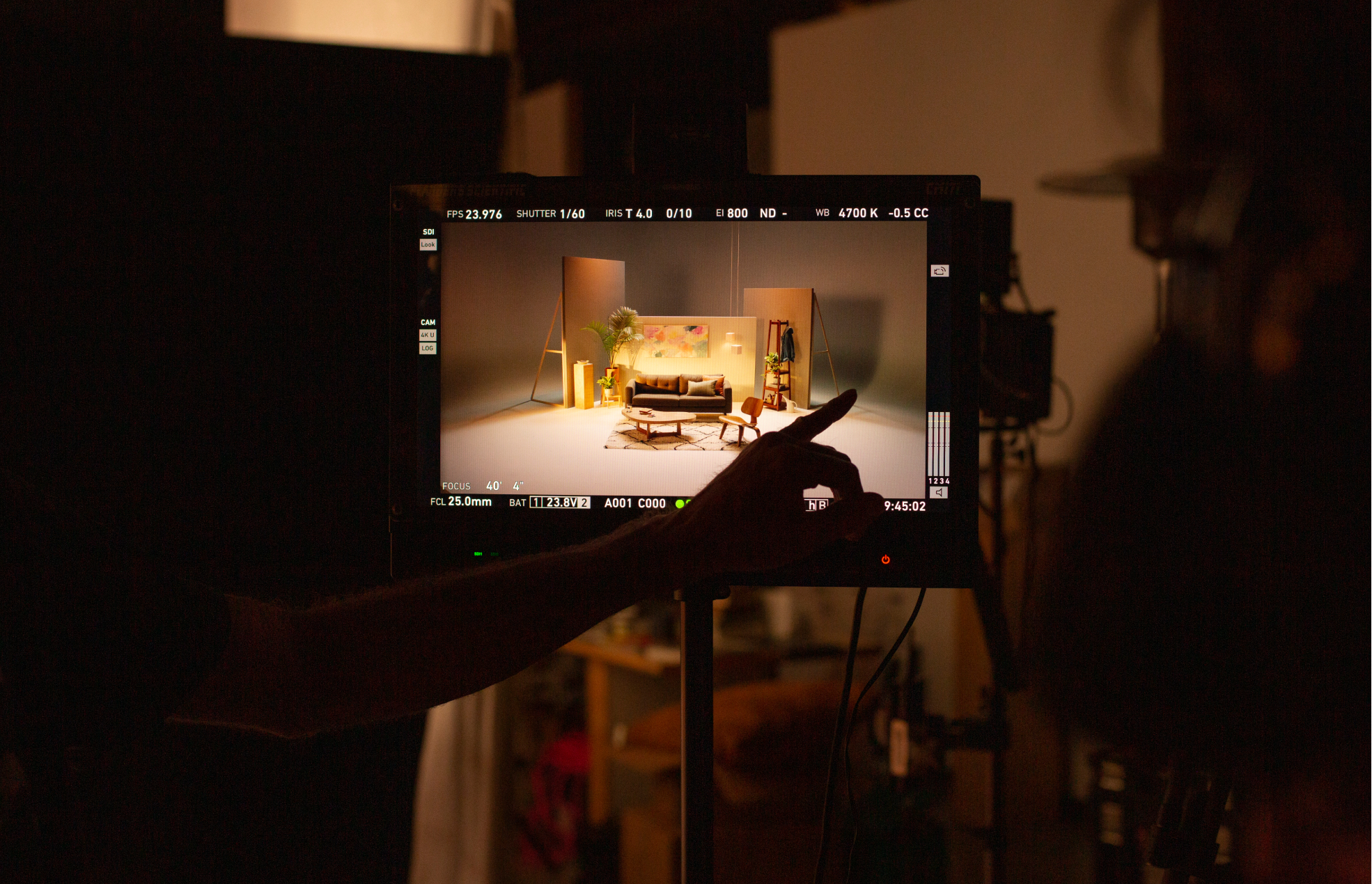
LIFE, RECENTLY
PHOTOGRAPHYBits and pieces.


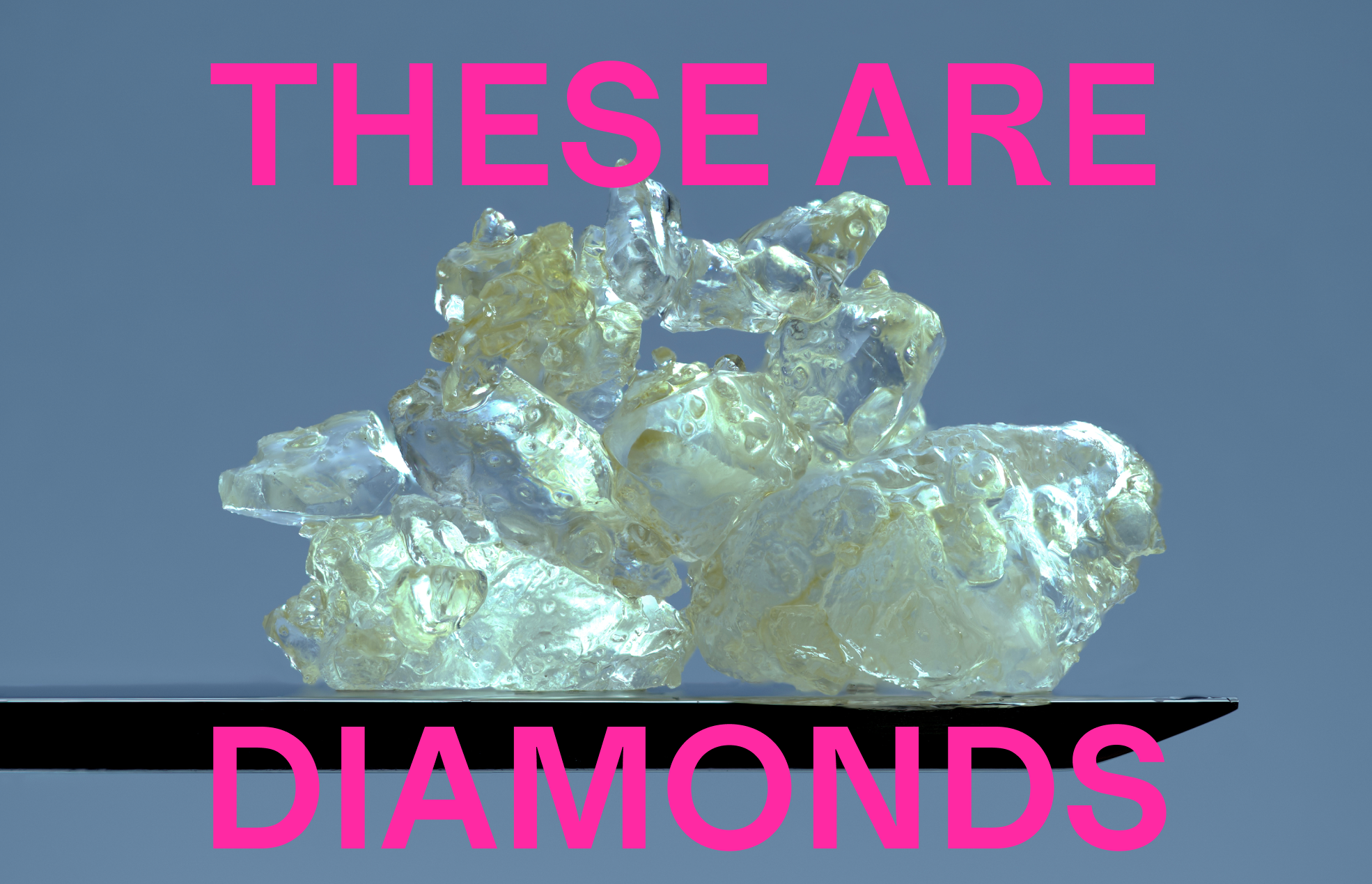
DIAMONDS
ART DIRECTION, PACKAGING DESIGNSometimes you have to go full Zazacore.
CREATIVE DIRECTION: Marc Hohmann


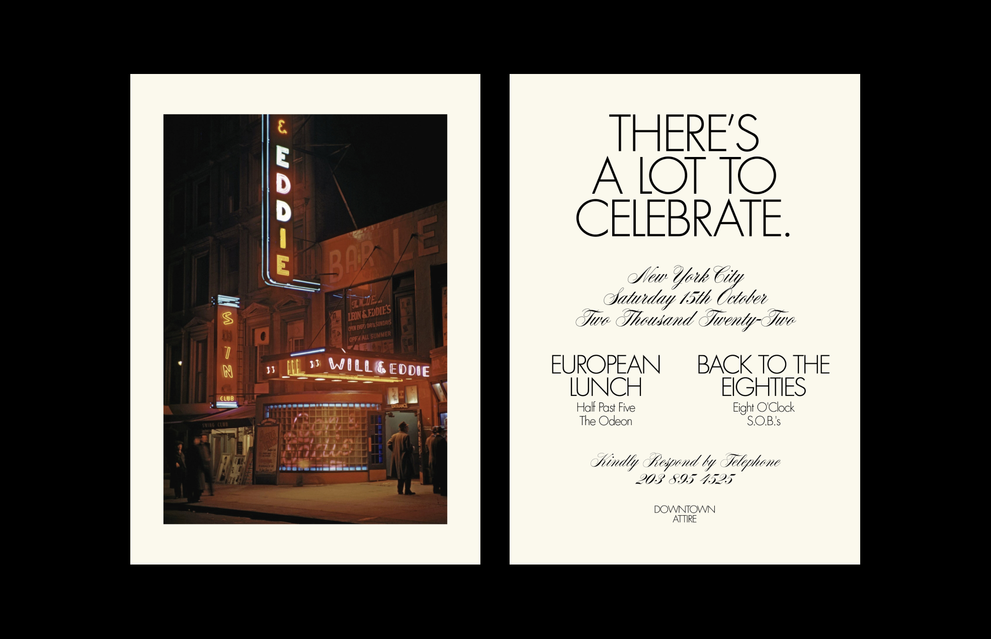
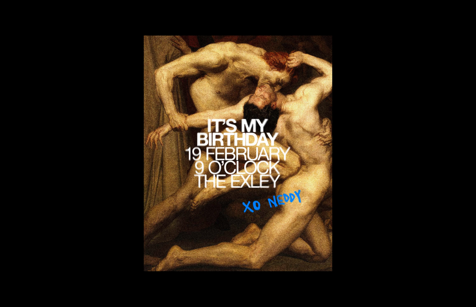
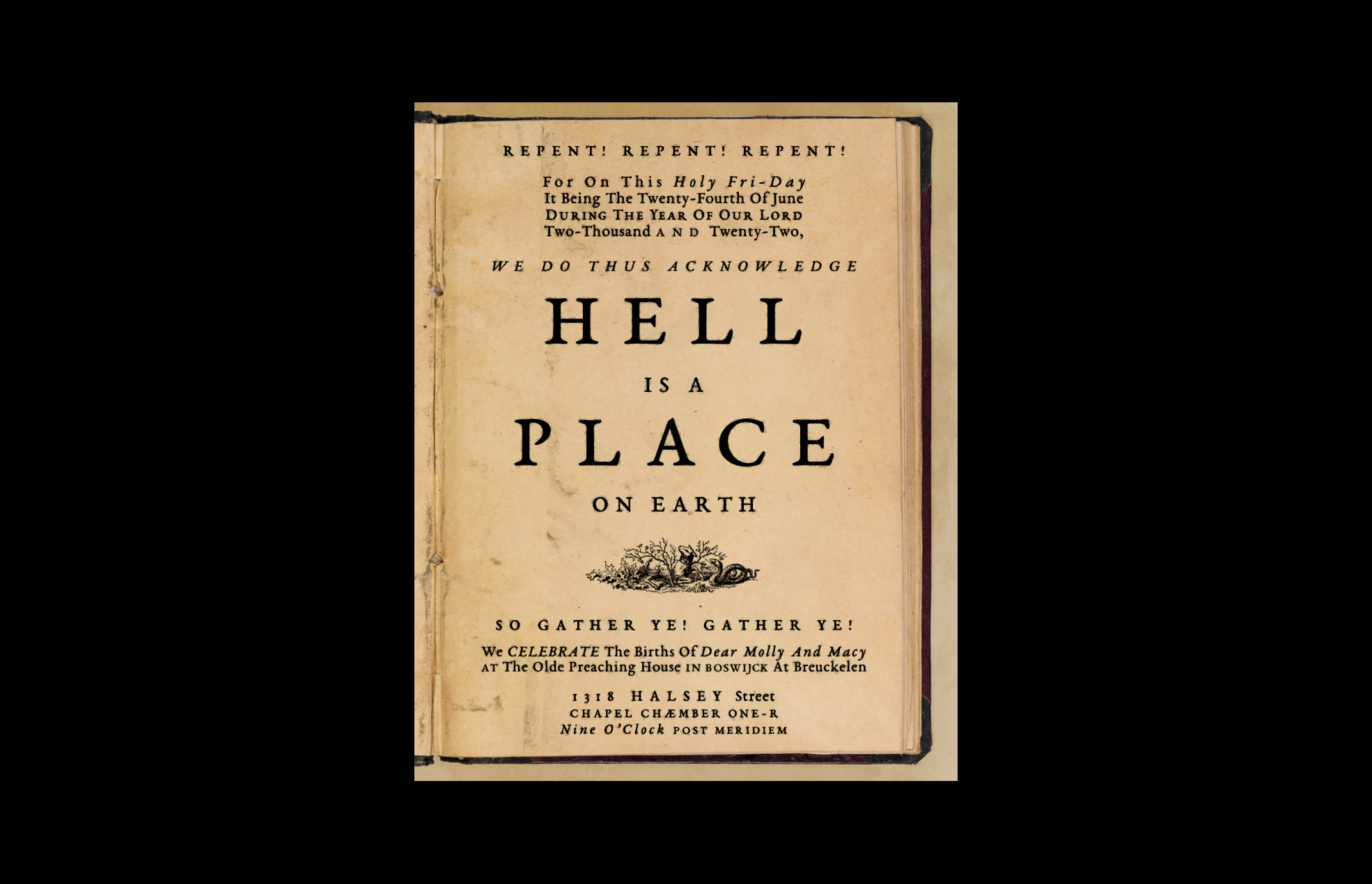
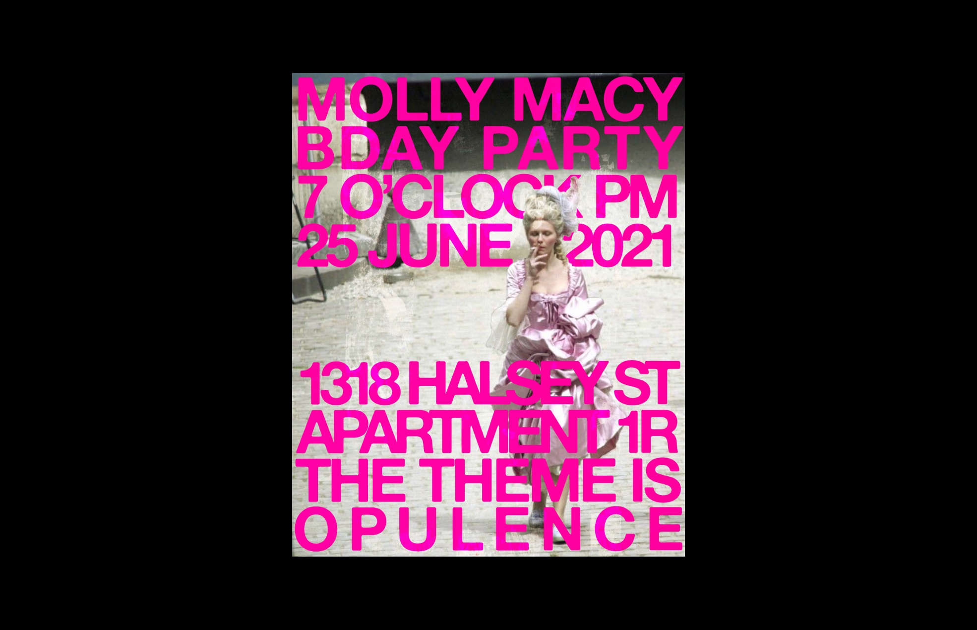
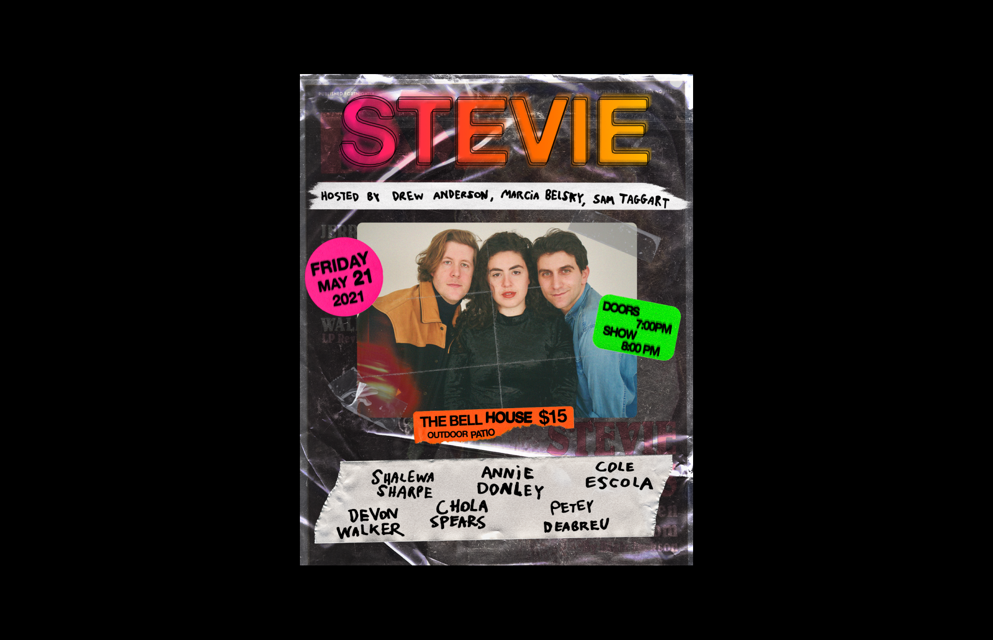
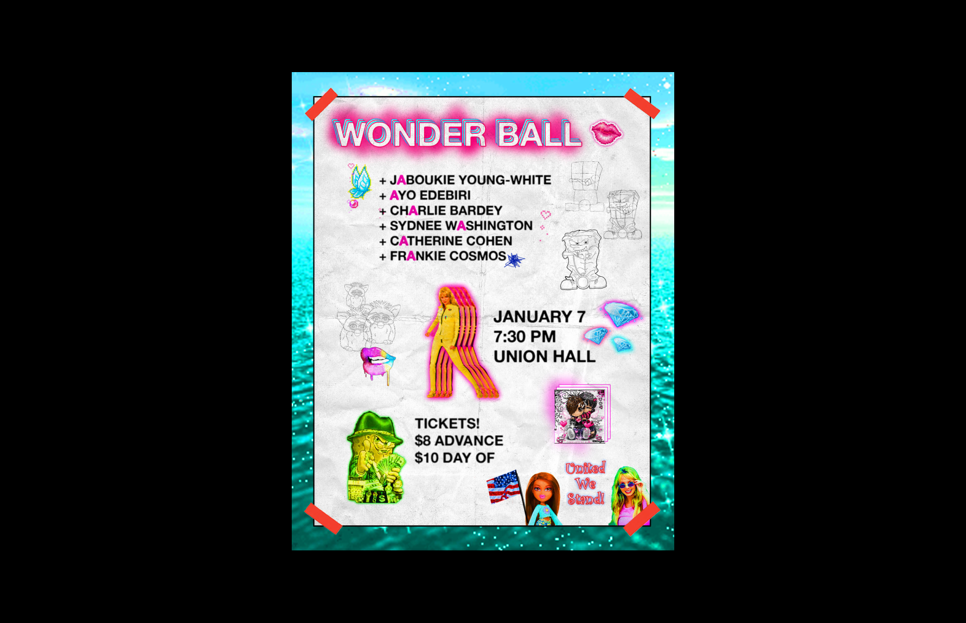
INVITATIONS
DESIGNFor friends and family.


PAX REBRAND
ART DIRECTIONA multi-year process of coaxing the brand out of its hard-edged, SF-y, tech startup past and into a softer, warmer, more human future culminated with this asset refresh. Weed is life, man.
WITH: Creech Studio
PHOTOGRAPHY: Jason Nocito


ERA LIFE CAMPAIGN
ART DIRECTIONMore laughter, more blazing, more dancing – more life! PAX captured real people –lovers, friends, that guy you saw at the skatepark – hanging out, getting stoned, and being themselves. It’s the joy of cannabis, raw and unfiltered.
CREATIVE DIRECTION: Anni Hall
PHOTOGRAPHY: India Sleem
VIDEO: Sacred Pact
WATCH THE SIZZLE


PAX DOT EDU
ART DIRECTIONIt’s a “how-to guide” set not in the sterile world of product unboxings but rather in a warm, home-like environment – an intimate reflection of the pandemic-era state of being.
CREATIVE DIRECTION: Anni Hall
VIDEO: BONE+GOLD
WATCH THE VIDEO


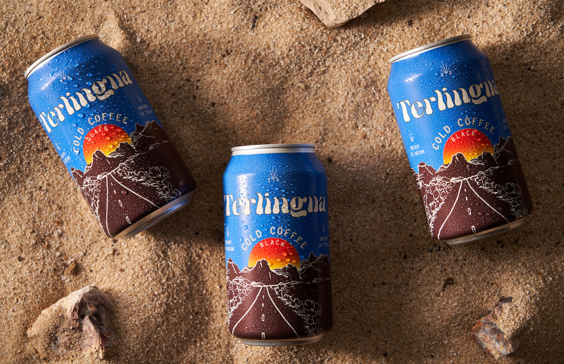
TERLINGUA COLD COFFEE
IDENTITY, PACKAGING, WEB DESIGNTerlingua captures the wide-open spirit of West Texas and pops it into a can. The identity and packaging draw upon the distant past to inform the future of on-the-go coffee. A little metro, a little retro – ah, perfecto.


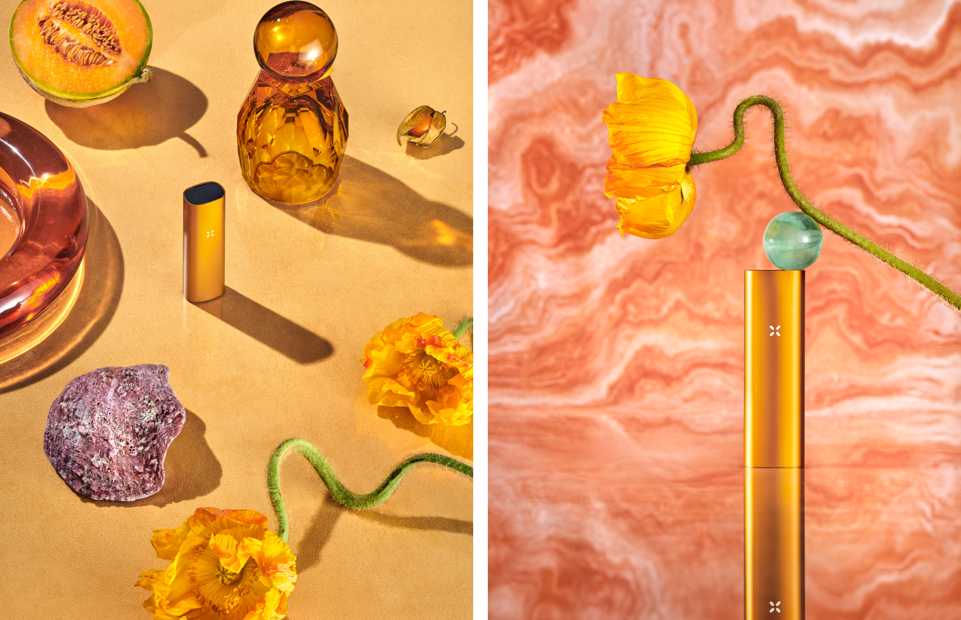
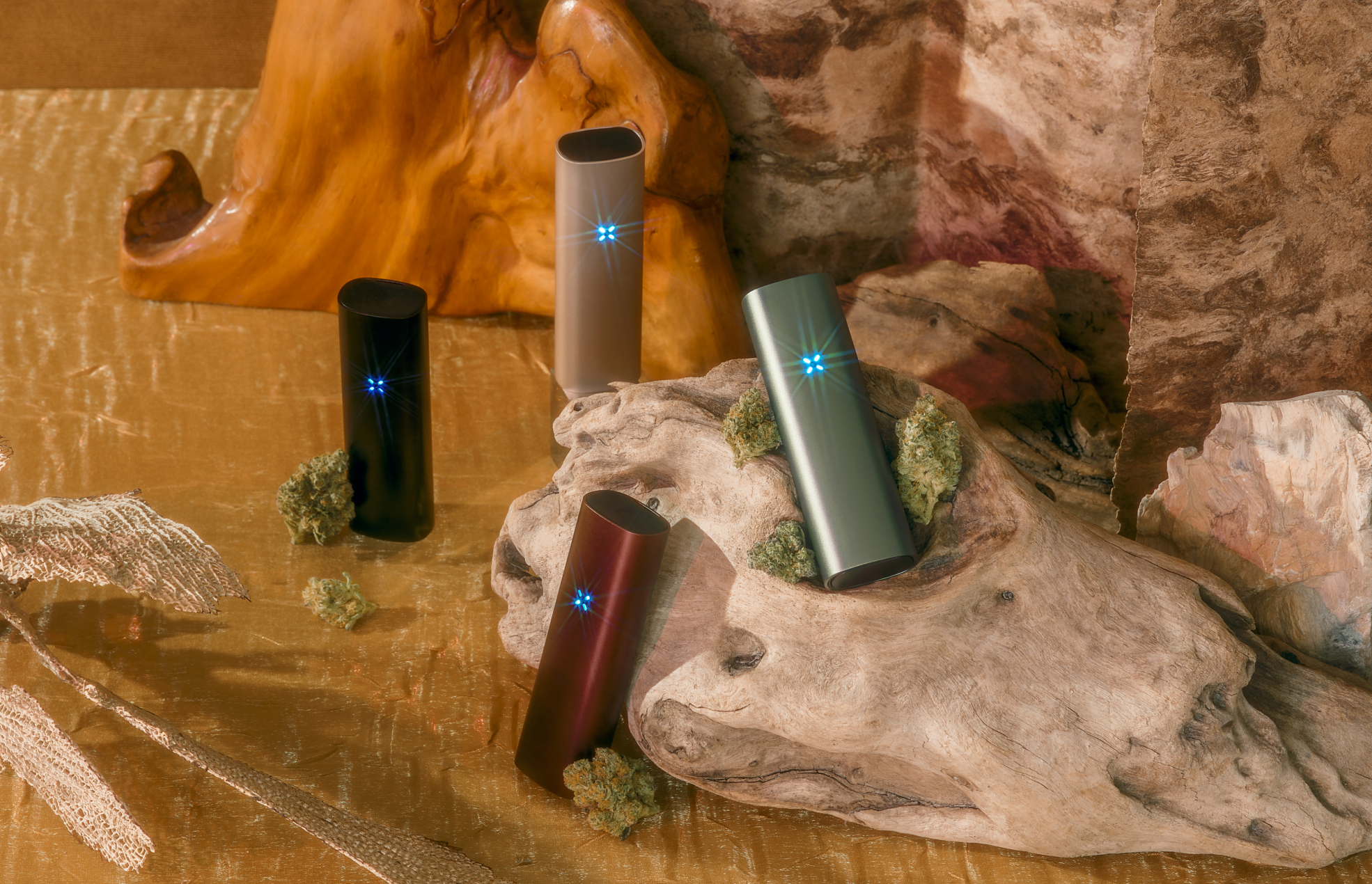
SUMMER SERIES
ART DIRECTION, PRODUCT DESIGNDrawing inspiration from the azure skies and golden hills of summertime in California, we celebrated a return to the world outside with limited-edition devices and sunlit photography – acknowledging a shift in consumer mindset and charting a vibrant, optimistic path forward.
PHOTOGRAPHY: Ian Shiver


PAX EMERGING PHOTOGRAPHERS
ART DIRECTIONIt’s every up-and-coming artist’s dream come true: a weed brand sends you a bunch of vaporizers and asks you to show them, in photos, what cannabis means to you. We rolled (lol) each mini-campaign out on social, giving the young artists a platform while firmly establishing ourselves as a patron of the arts.
CREATIVE DIRECTION: Anni Hall
PHOTOGRAPHY: Evan Angelastro, Annie Powers, Chase Porter, Coco Winston, Gianny Matias, Chase Baxter


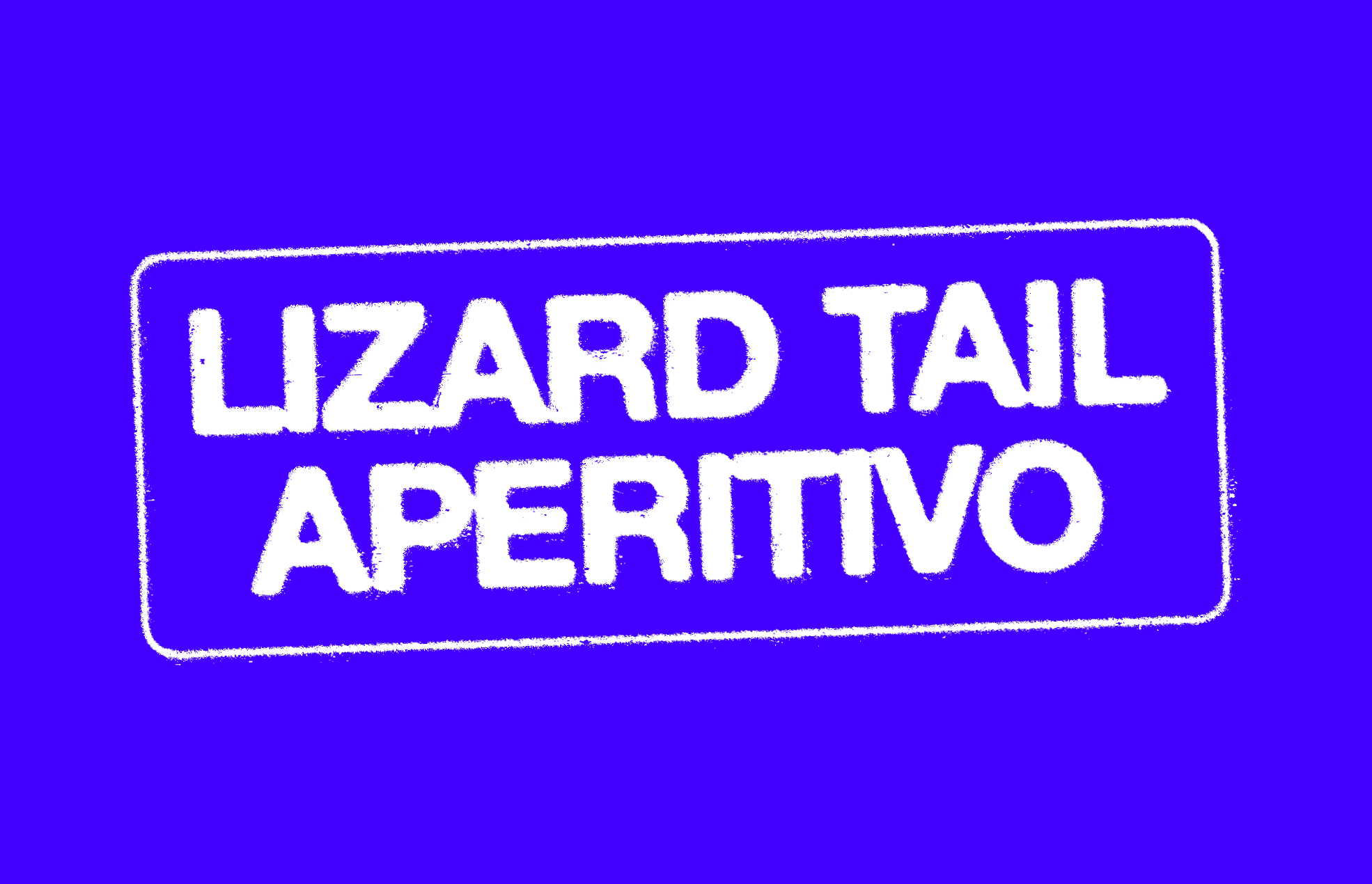
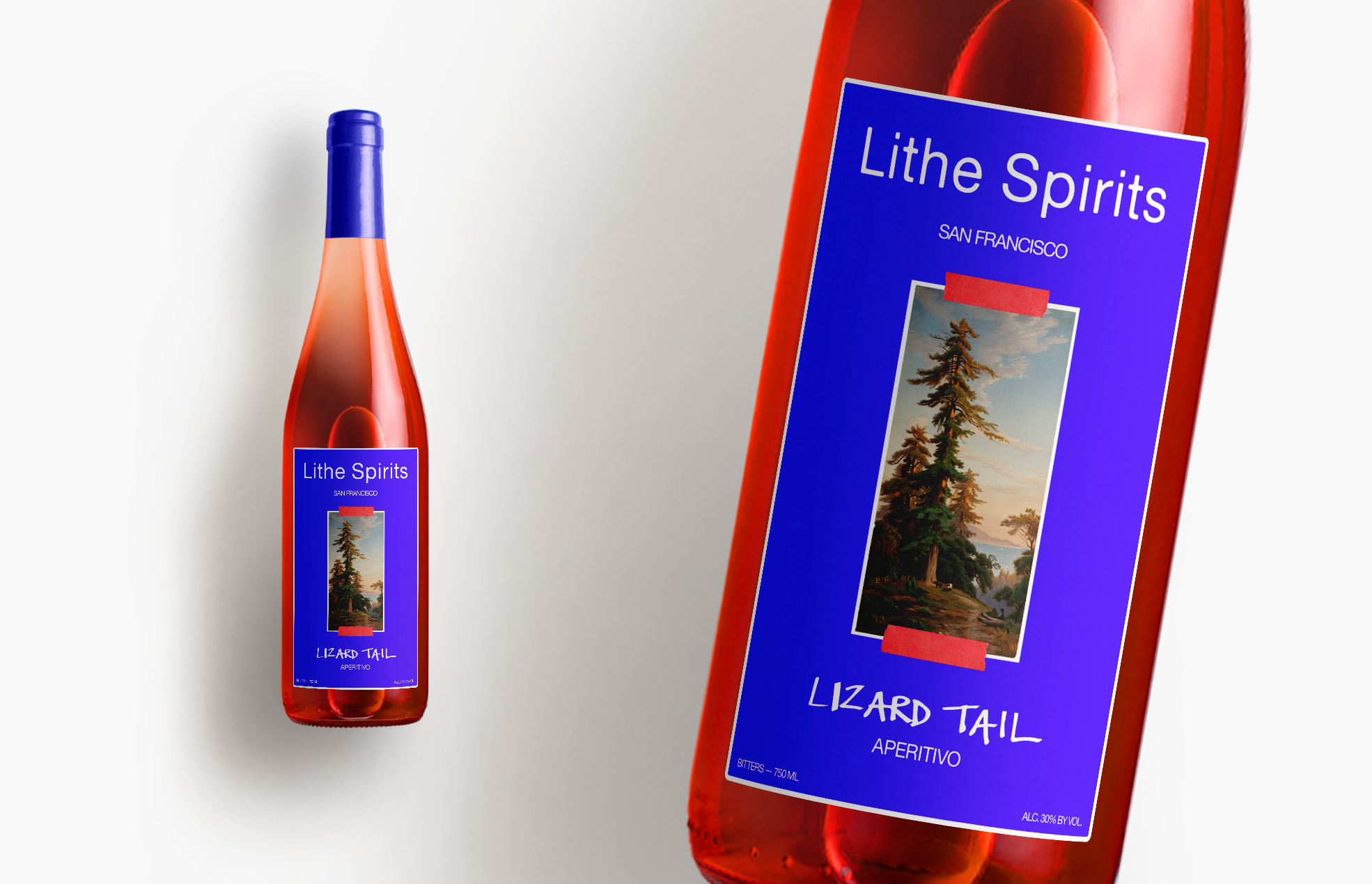
LITHE SPIRITS
IDENTITY, PACKAGING DESIGNI worked closely with the founders of an emerging liquor brand to develop identities and label designs for an upcoming line of spirits distilled in Northern California. Big flavor resulted in bold colors and hand-painted type.

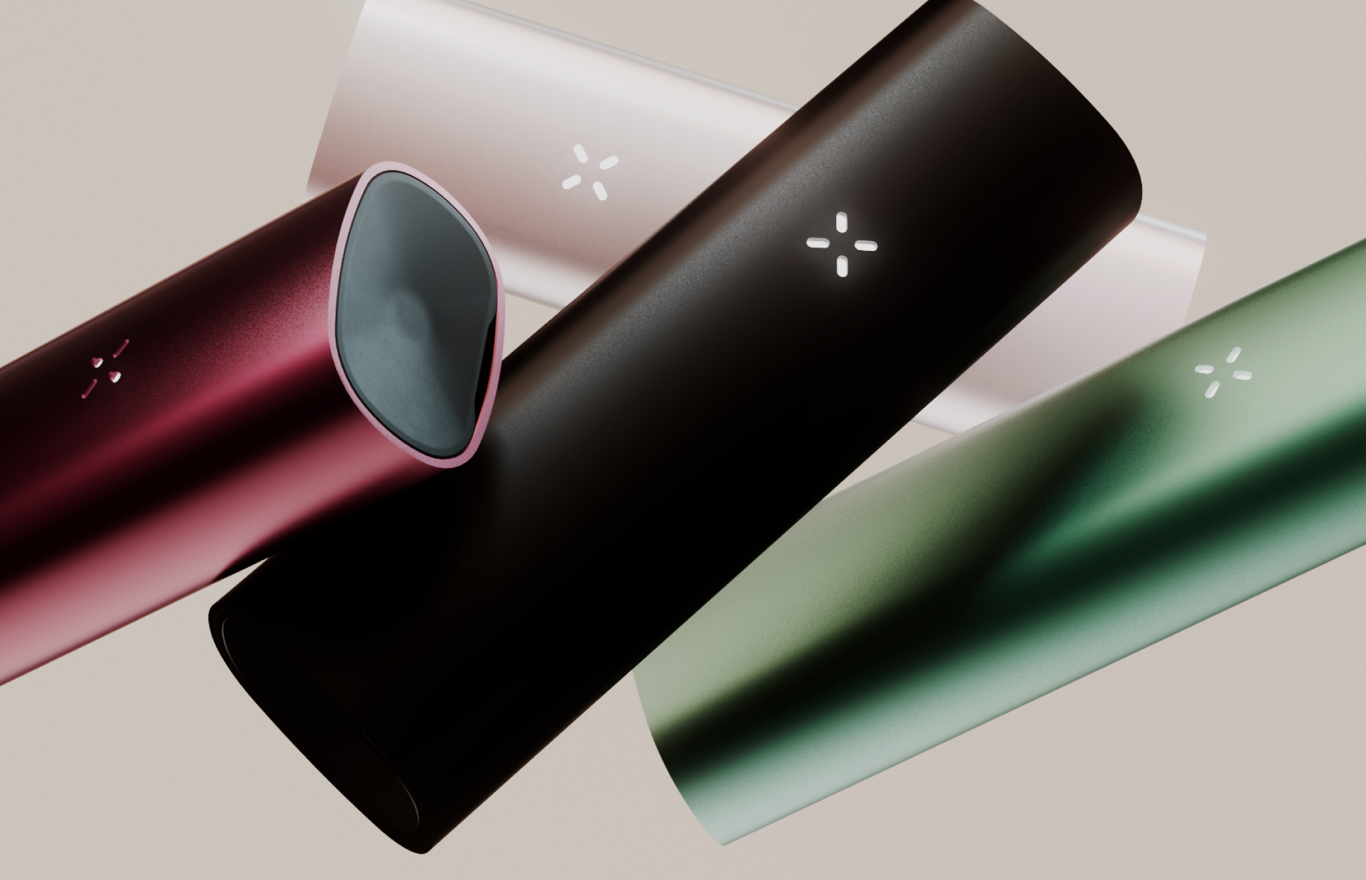
PAX 3.5 CAMPAIGN
ART DIRECTION, DESIGNIt felt like we’d be stuck inside forever, so we thought we might as well make it look nice. So here’s PAX 3.5 on the coffee table of your fever dreams, captured in all of its jewel-like glory amongst a collection of daily treasures. Easy on the eyes, easiest highs.
CREATIVE DIRECTION: Anni Hall
PHOTOGRAPHY: David Brandon Geeting, Kelsey McClellan


GOAT MANAGEMENT
IDENTITYThe most secretive artist management agency in LA needed an identity to match. And a website. But not too much of a website. Just a little something.


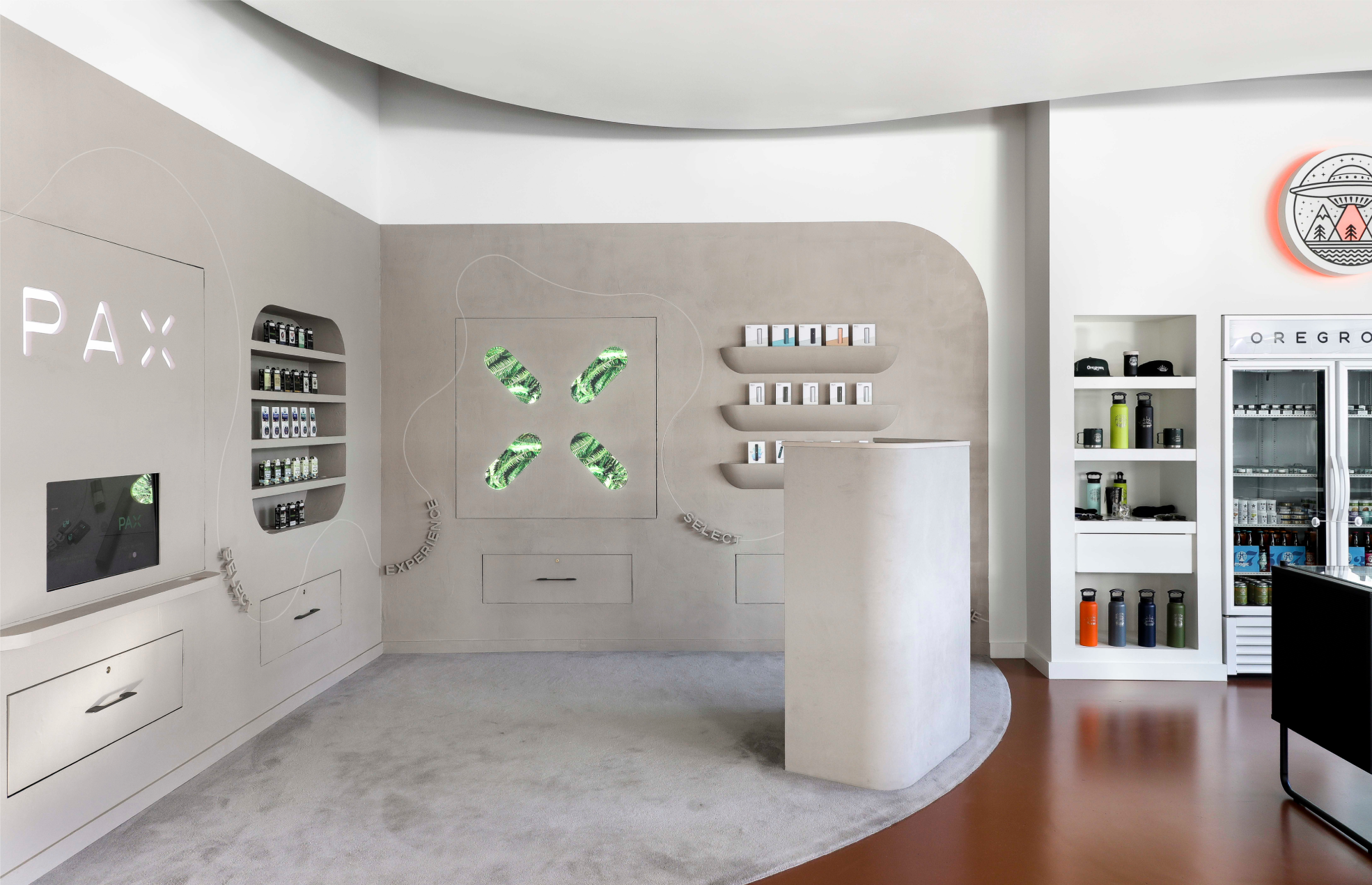
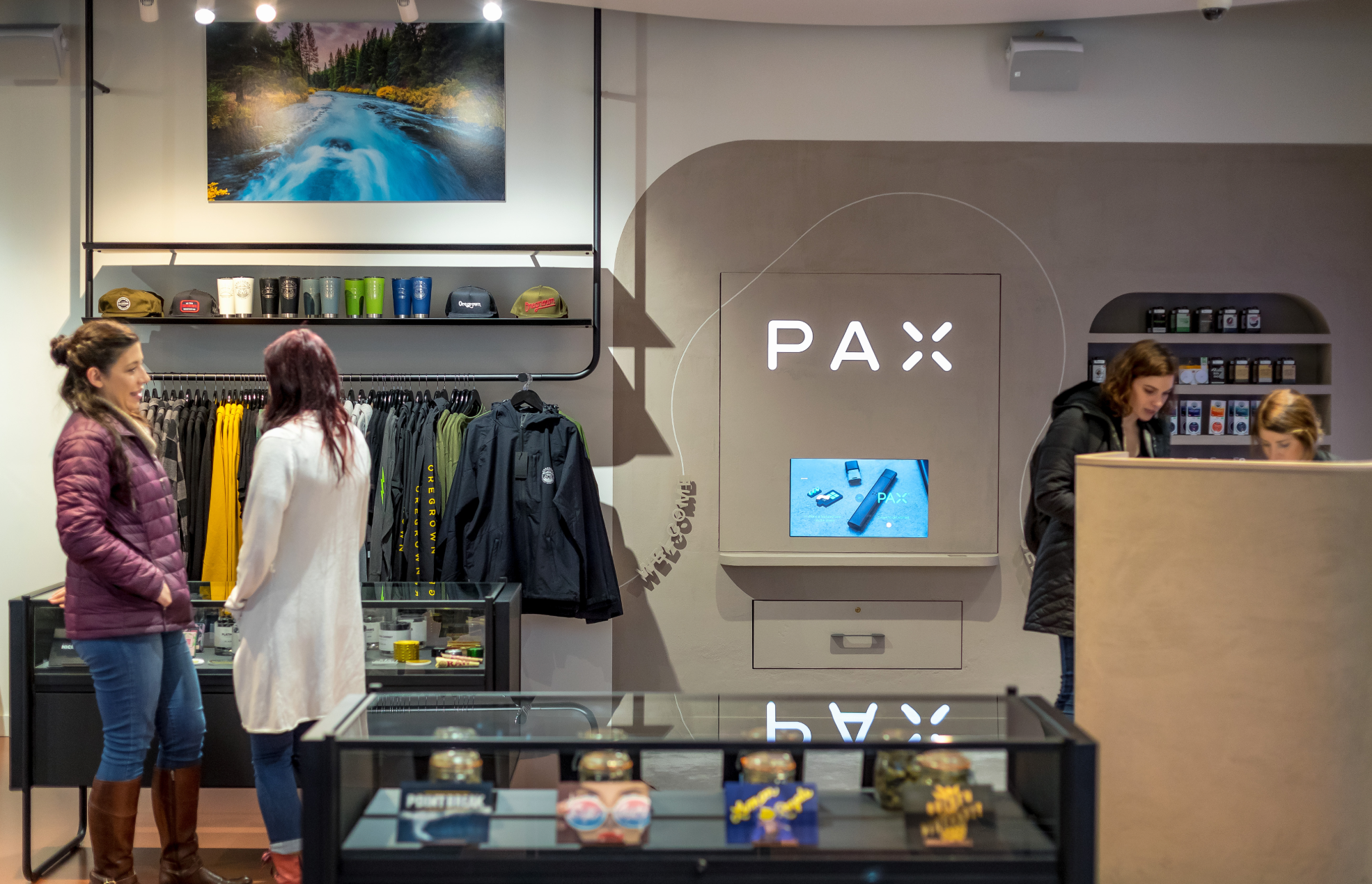
OREGROWN SHOP
DESIGNProvided direction for our first foray into experiential retail. Limewashed walls, soft-glow lighting, and rounded egdes generated a wabi-sabi corner of tranquility in an otherwise hectic dispensary.


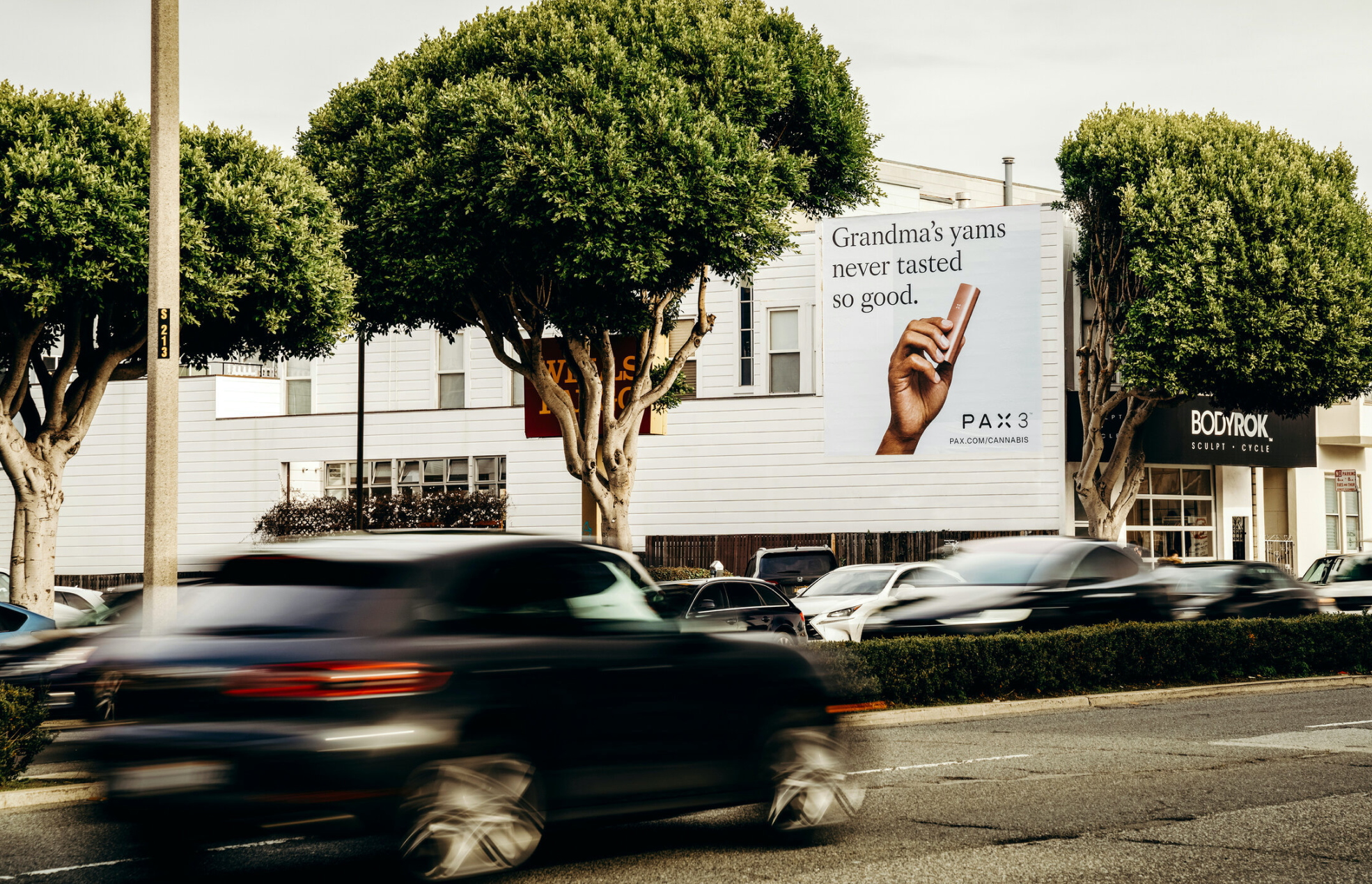
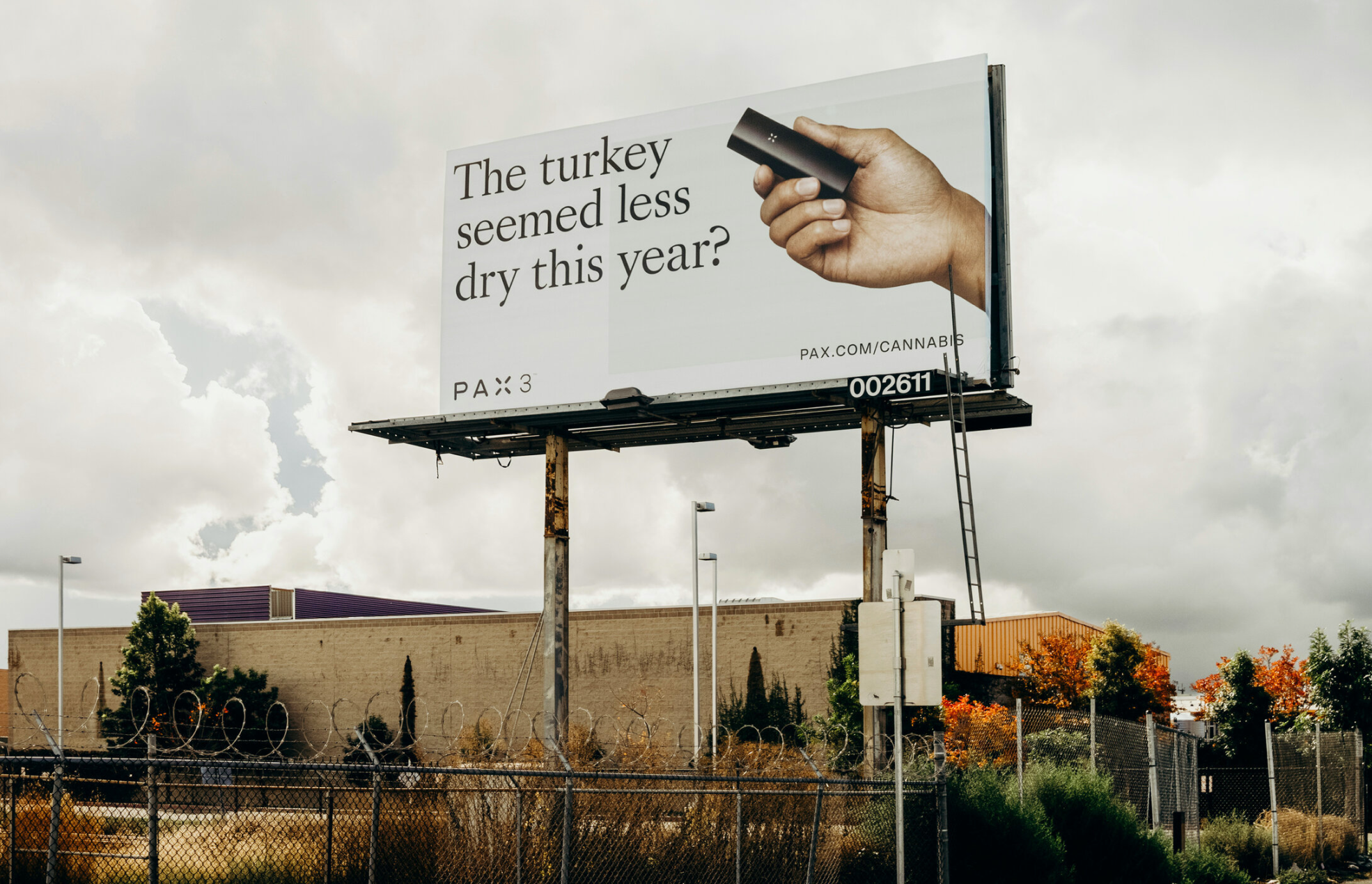
HOLIDAY BILLBOARDS
DESIGN, COPYWRITINGWe nodded to the best part of Thanksgiving (smoking weed with your cousins) with our first-ever OOH campaign. Hand-painted billboards en route to West Coast dispensaries pointed potential stoners in the right direction. Obvious dad jokes helped normalize a very normal activity. Happy holidaze!
COLLABORATORS: Morgan Sterns, Anni Hall


PRIDE BUS
DESIGNRented a bus, added rainbows, hired drag queens, put Jenny Lewis on the roof, paraded it through SF. It was good, you know, we enjoyed it.


EQUINOX GLOBAL SALE
ART DIRECTION, DESIGN
When cast bronze perfectly replicates an organic form, the distinction between NATURAL and ARTIFICIAL gets blurry. Unafraid to laugh at ourselves, we shot a perfect “artificial” rendering of someone’s very-real reality. It really makes you think: Can you purchase the intangible? Can you own the ideal? Can you buy the life you want to live? Sale comes but once a year – might as well try! 15,000 new members did.
CREATIVE DIRECTION: Timothy Strudwick, Juliana Frankovich


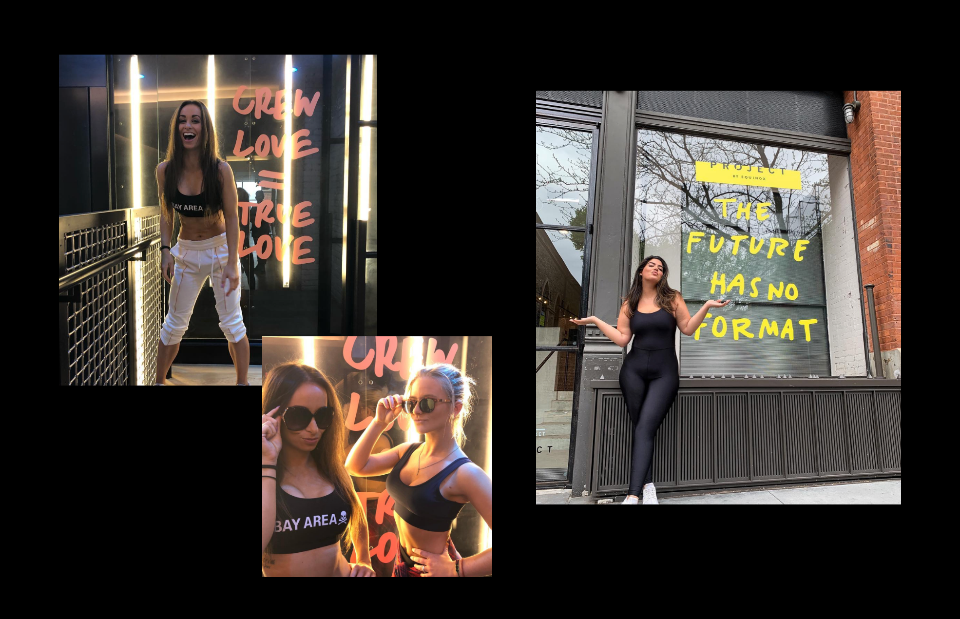
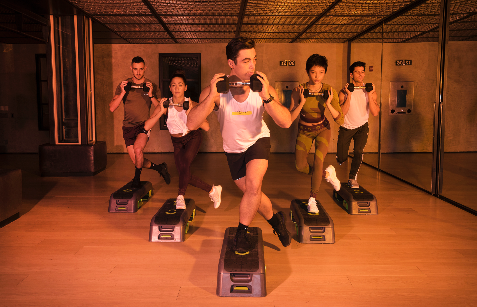
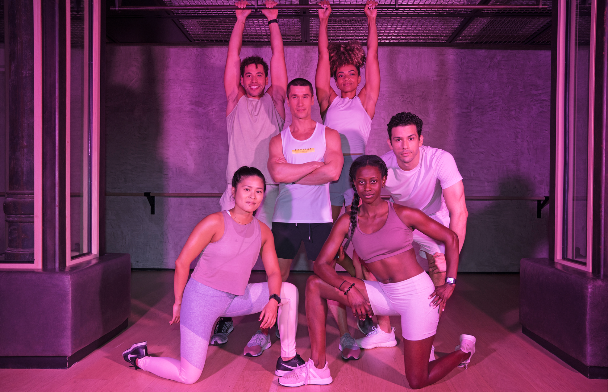
PROJECT® BY EQUINOX
DESIGNEquinox’s fitness incubator needed a fresh coat of paint. What better time to redo the interior, reshoot the trainers, and reposition PROJECT® by Equinox as the ultimate downtown boutique? Cold eucalyptus towels included.
ART DIRECTION: Vanina Kim
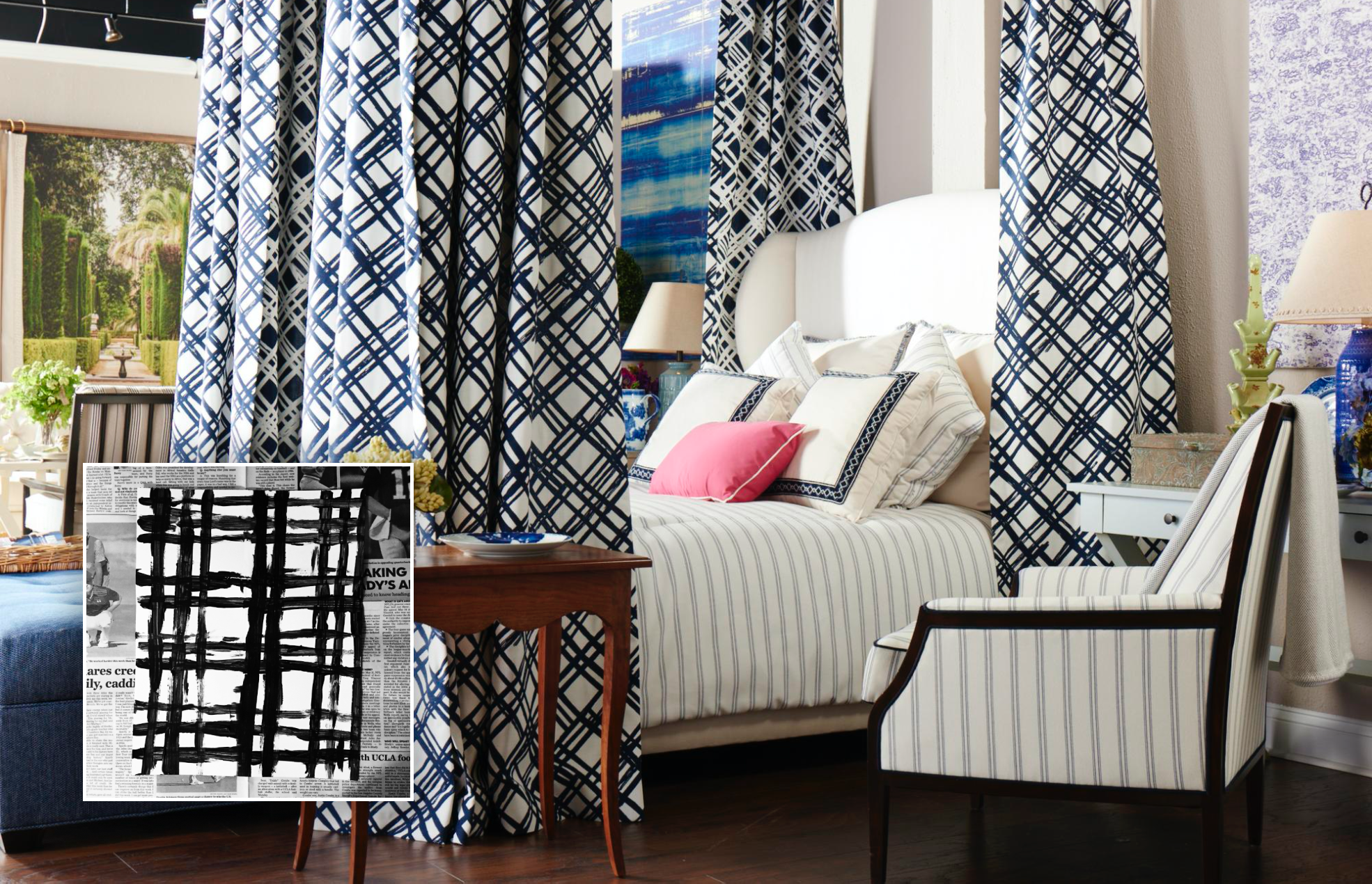
SUNBRELLA
DESIGNLong story short: I found myself in North Carolina designing hand-painted textile patterns for Barney’s New York. (Pour one out.)


Fever Dream © Thursday Jan 12 2023